Focusing on user experience, Lazy Travelers is a mobile app offering travel inspiration, efficient trip planning, and collaboration with fellow travelers.
Designed for both meticulous planners and spontaneous adventurers, Lazy Travelers simplifies your journey with all-in-one features, including a community, travel inspiration, planning tools, and an intuitive travel map.
In the post-pandemic world, travelers are eager to resume exploration, prioritizing authentic local experiences and recommendations from locals and well-traveled friends. Flexibility in trip planning, with a focus on spontaneity and exploration, is paramount.
However, challenges arise when organizing transportation and optimizing itineraries amidst the myriad of travel platforms. Popular apps like Google Maps, TripAdvisor, and Airbnb are essential, but avoiding touristy spots in favor of authenticity remains a key goal. Despite this, travelers desire to craft their own itineraries and actively contribute to the travel community, fostering a spirit of independent exploration.


Demographics and Trends:
Backpacking and solo traveling have been on the rise, the average age is 24 years old, with a notable increase in backpackers over 30 years old since 2002. Language learning and immersing in local experiences are significant aspects of modern modern backpacking and solo travel.
- Dream Big Travel FarSafety and Concerns:
Concerns about getting lost are prominent, with safety being a priority for travelers.
Accommodation Trends:
Budapest is highlighted as a budget-friendly European destination for hostel accommodation. Around 21% of backpackers/solo travelers use Airbnb as their accommodation choice, and the majority of travelers stay in hotels or hostels.
- Dream Big Travel Far
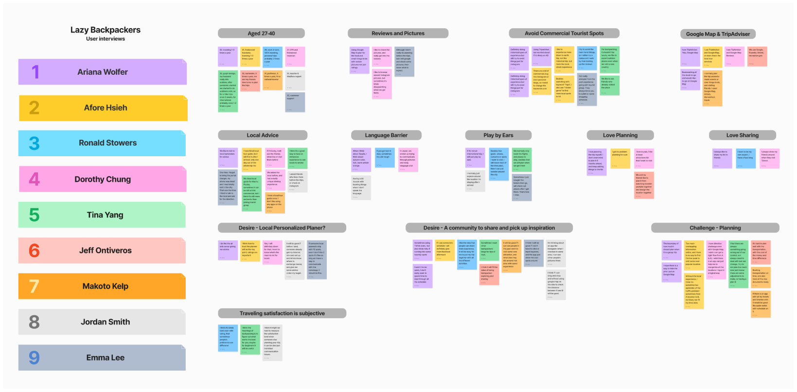
Based on in-depth interviews with 10 travelers, a clear trend emerged.
Today's travelers prioritize authentic local experiences and rely on recommendations from both locals and well-traveled friends.
Flexibility in trip planning is a common theme, with a focus on spontaneity and exploration. However, challenges arise when organizing transportation and optimizing itineraries. While popular travel apps like Google Maps, TripAdvisor, and Airbnb play a role, the emphasis remains on avoiding touristy spots in favor of authentic experiences. What sets these travelers apart is their desire to craft their own itineraries and actively contribute to the travel community, emphasizing a spirit of independent exploration.


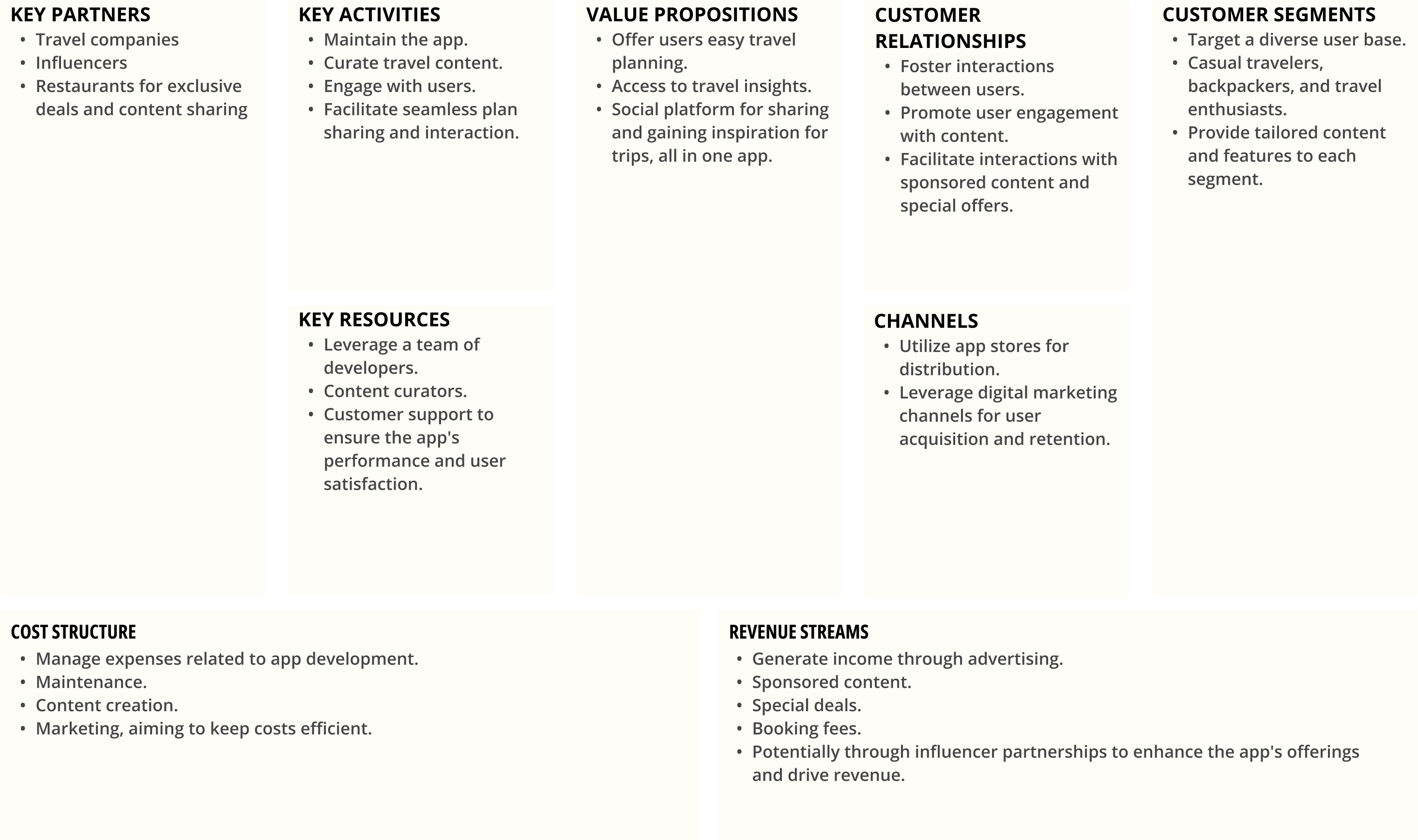
By delving into the Business Canvas model, we dissect the key elements that drive the app's functionality and pave the way for its success. From strategic partnerships to revenue streams, we provide insights into how Lazy Travelers aims to create a harmonious blend of user experience and business sustainability.


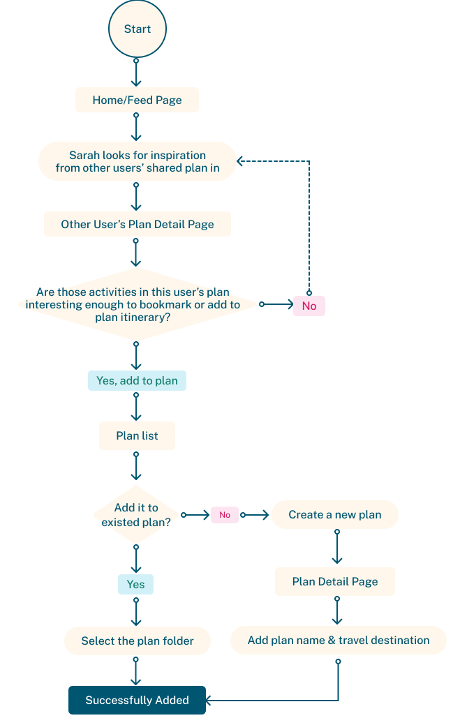
Scenario 1: Sarah, a spontaneous traveler, tends to avoid detailed trip planning and prefers to explore on the go. With her flight to Taiwan just a day away, she's looking to gain some last-minute inspiration from fellow travelers to make the most of her upcoming adventure.
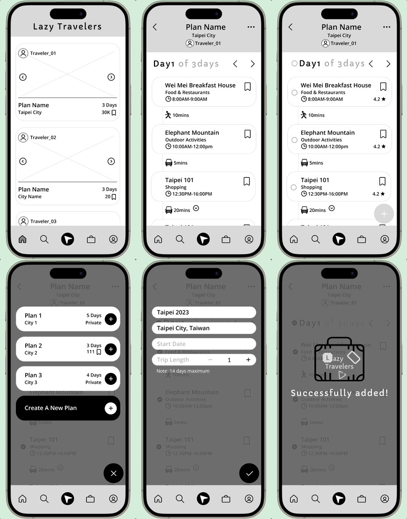
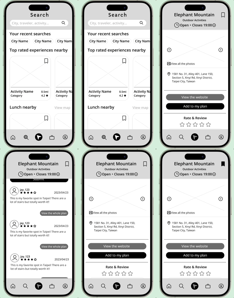
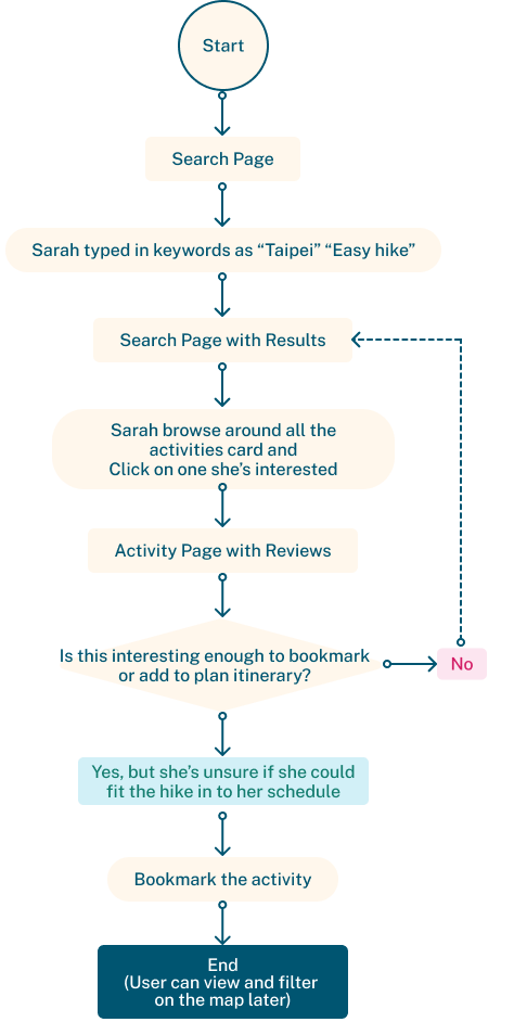
Scenario 2: Alex and his friend Bob are on a journey together. They jointly oversee their travel plan but aren't fond of a strict daily schedule. They appreciate having the flexibility to include activities spontaneously as they explore the city. They also value some solo time within their plan.
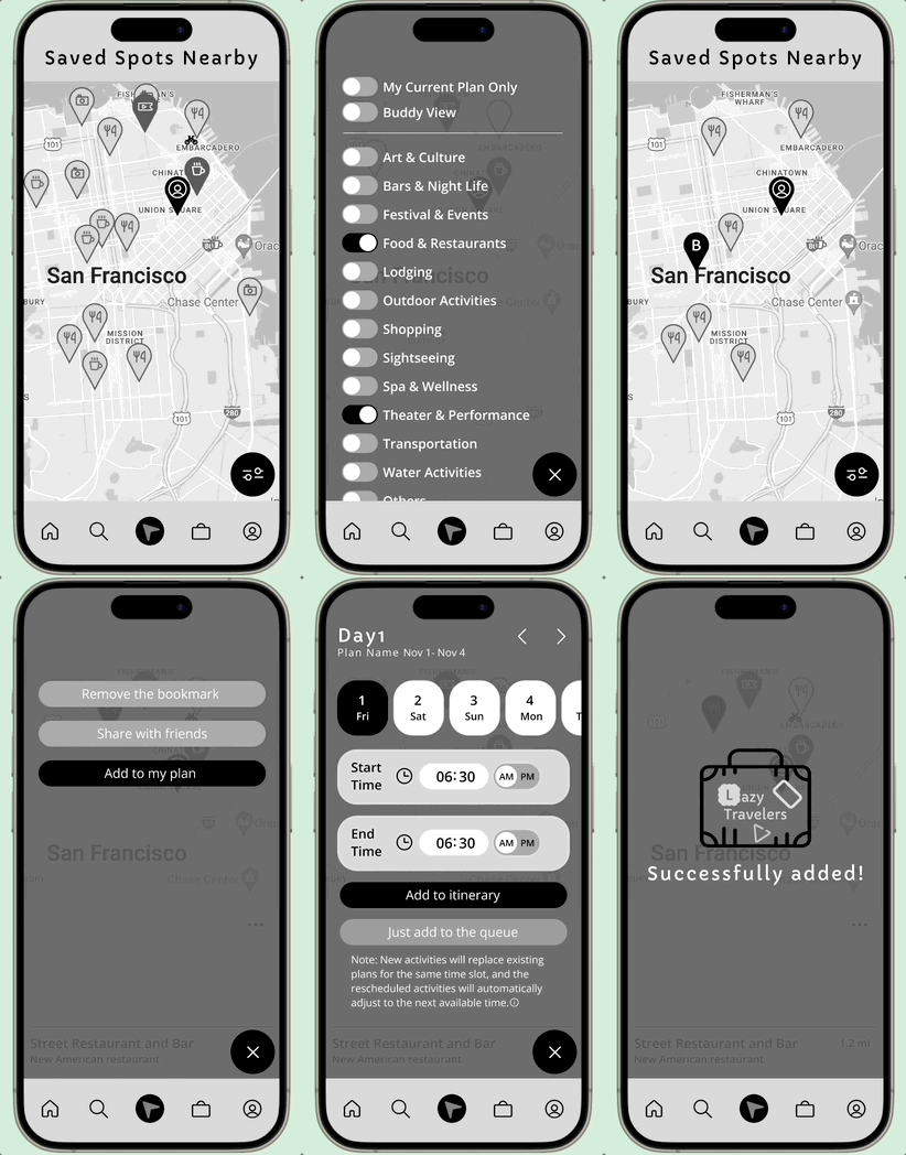
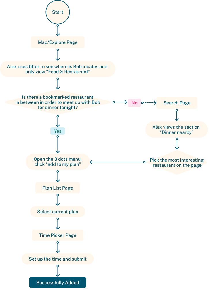


Product Under test
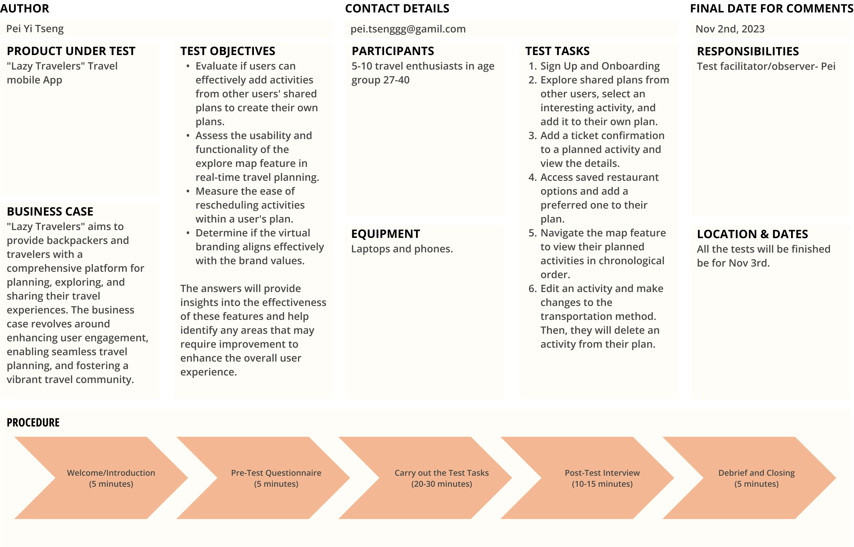
"Lazy Travelers" Travel mobile App
Business Case
"Lazy Travelers" aims to provide backpackers and travelers with a comprehensive platform for planning, exploring, and sharing their travel experiences. The business case revolves around enhancing user engagement, enabling seamless travel planning, and fostering a vibrant travel community.
Test Objectives:
The answers will provide insights into the effectiveness of these features and help identify any areas that may require improvement to enhance the overall user experience.
Participants
5-10 travel enthusiasts in age group 27-40
Equipments
Laptops and phones.
Test Tasks:
Responsibility
Test facilitator/observer- Pei
Dates
All the tests will be finished before Nov 3rd.
Procedure:
The "Lazy Travelers" app has resonated with users who appreciate its organizational features, especially the map functionality that keeps travel plans in check.
The map's ability to showcase bookmarks and must-do activities along the plan, as well as display friends' locations, has garnered praise. And for users who don’t like to plan, they enjoy “stealing” the quick travel inspiration from other travelers’ experience with one click.
While users commend the app's strengths, they also provide valuable insights for improvement. Suggestions include enhancing the visibility of key CTA “Add to My Plan”, simplifying buttons and icons, and considering feature adjustments to streamline the app's interface.
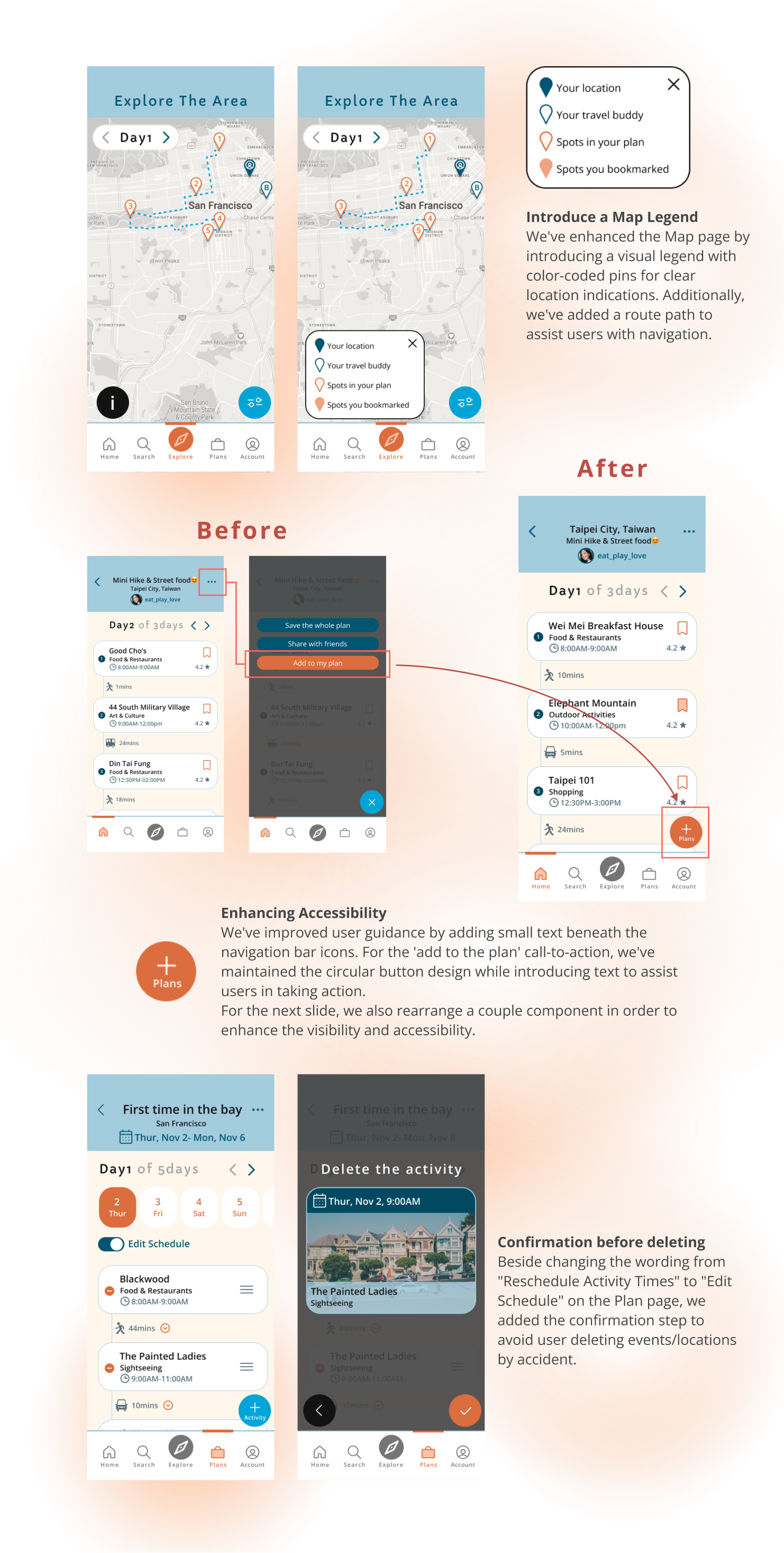
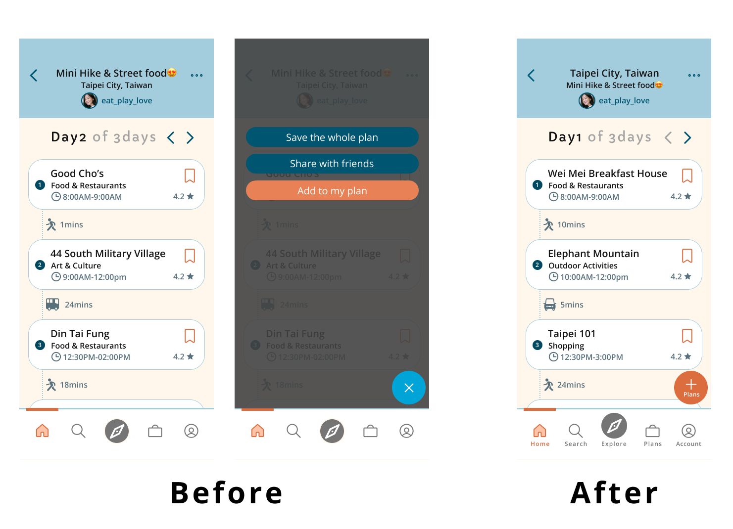
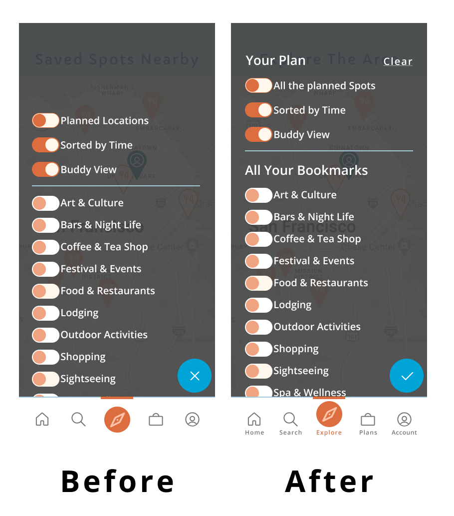
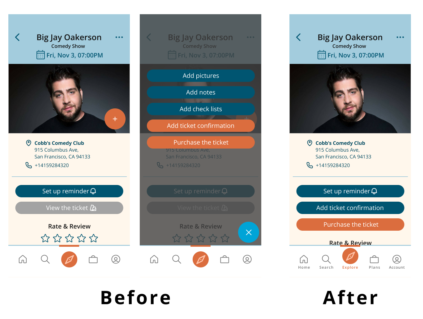
Leveraging the insightful feedback from our users, we embarked on a series of iterative refinements. These adjustments included optimizing the 'add to the plan' call-to-action button, ensuring alignment across all buttons, and establishing a consistent logic where the 'x' serves as a dismiss action, and the 'v' signifies confirmation etc.
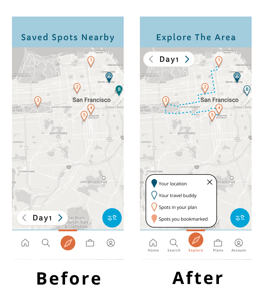
Introduce a Map Legend
We've enhanced the Map page by introducing a visual legend with color-coded pins for clear location indications. Additionally, we've added a route path to assist users with navigation.
Enhancing Accessibility
We've improved user guidance by adding small text beneath the navigation bar icons. For the 'add to the plan' call-to-action, we've maintained the circular button design while introducing text to assist users in taking action.
For the next slide, we also rearrange a couple component in order to enhance the visibility and accessibility.
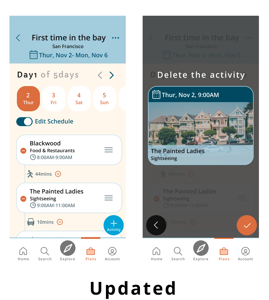
Confirmation before deleting
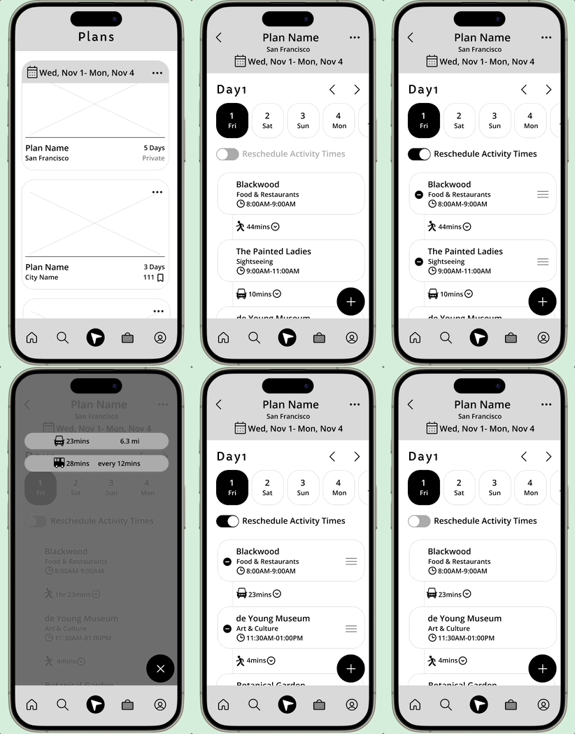
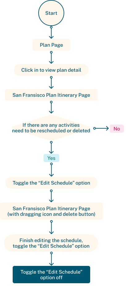
Beside changing the wording from "Reschedule Activity Times" to "Edit Schedule" on the Plan page, we added the confirmation step to avoid user deleting events/locations by accident.
Throughout the development of Lazy Travelers, I learned there are diverse needs for different travelers. For instance, spontaneous users may not extensively utilize the "Plan" feature but find immense value in the map's bookmark display and filtering options. The app's versatility allows last-minute planners to craft their unique itineraries by leveraging shared plans from the community.
Despite the app's rich feature set, the key takeaway revolves around adhering to the essence of "Lazy Travelers." The brand aims to be inclusive, offering assistance to users regardless of their planning proficiency. By fostering a community where users willingly share their travel "recipes" and insights, Lazy Travelers becomes a welcoming space for those seeking collaborative travel experiences.
Additionally, user feedback underlines the importance of considering existing user habits. Some users may prefer their established methods, highlighting the need to incorporate incentives, promotions, or special offers to attract users towards adopting new practices. This insight prompts future considerations for integrating features that align with users' habits and preferences, ensuring the app remains engaging and valuable.
In essence, Lazy Travelers has evolved not just as a travel planning app but as a dynamic platform that embraces diverse travel styles while staying true to its ethos of simplicity and community collaboration.

