Tequila AF(Additive-Free) E-Commerce project is an online platform aimed at creating a user-friendly and engaging space for tequila enthusiasts. It offers a wide range of high-quality tequila products for purchase and provides informative articles on various tequila-related topics. The platform strives to provide an enjoyable and educational experience for users who are passionate about tequila, catering to both novice and experienced enthusiasts.
The Sprit Business shows that the U.S. tequila market is experiencing remarkable growth, expected to outpace the global spirits category with a projected annual growth rate of 9% between 2022 and 2027.

Tequila is set to become the most valuable subcategory in the U.S. spirits market in 2023, surpassing vodka and whiskey.
A prominent trend in the tequila market is the growing preference for additive-free tequila, indicative of consumers' heightened awareness of product quality and purity. The project focused on creating a responsive, user-centric platform designed to streamline the tequila purchasing process. Additionally, it aimed to position the brand distinctively amidst local competitors by serving as an educational resource on the intricacies of additive-free tequila, enhancing its visibility and appeal.




Tequila Market in the U.S.:
Rapid growth, outpacing the overall spirits market. Tequila to become the most valuable subcategory, surpassing vodka and whiskey.
- The Spirt Business
Tequila Drinkers Demographics:
Largest consumers: Ages 25-34, primarily in California.
- StatistaBenefits of "Additive-Free" Tequila:
Transparency, Authenticity, Complexity, Avoiding Artificial Flavors, Health Consciousness, Educational Value, Support to Traditional Craftsmanship, Enhanced Taste and Aroma.
- VinePair
After meeting with the client, we narrowed down the main competitors in the California Tequila market are Old Town Tequila, Siptequila, and Bitter & Bottles.
Here are the key findings from our analysis:
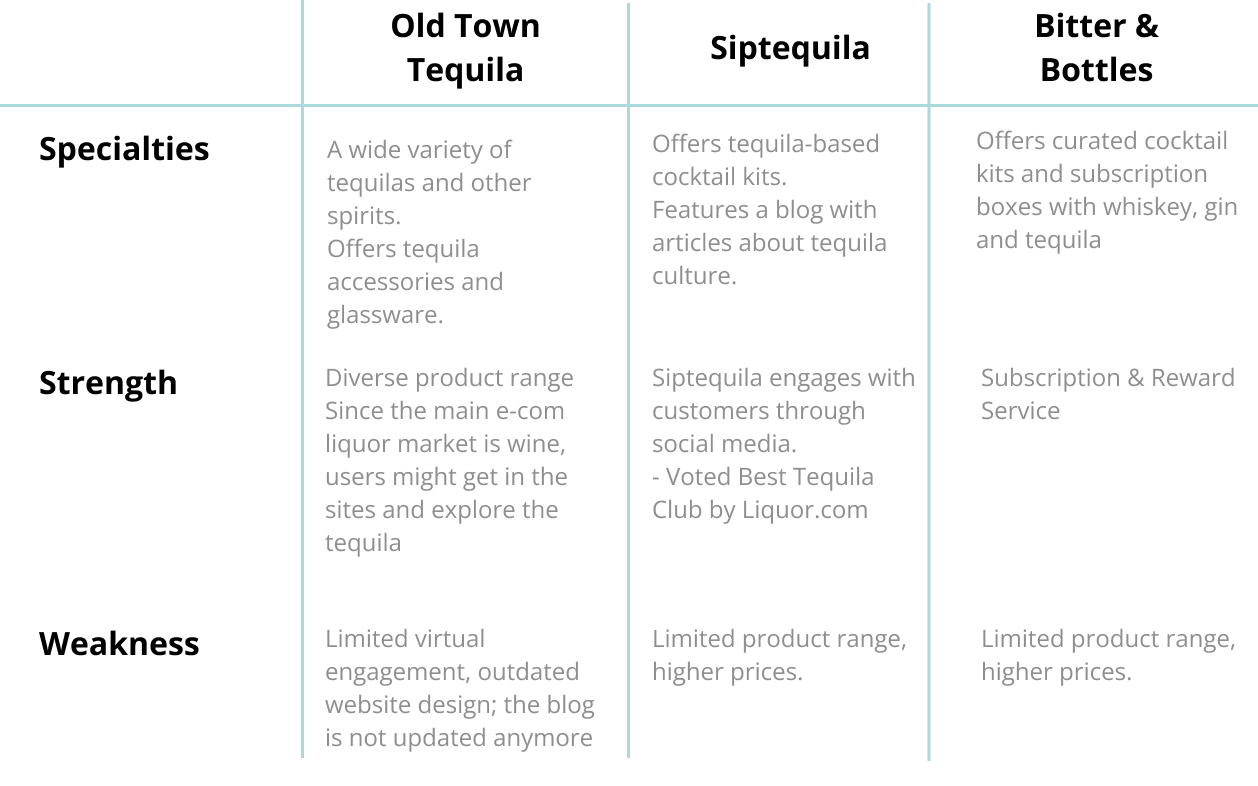
Old Town Tequila
Siptequila
Bitter &Bottles
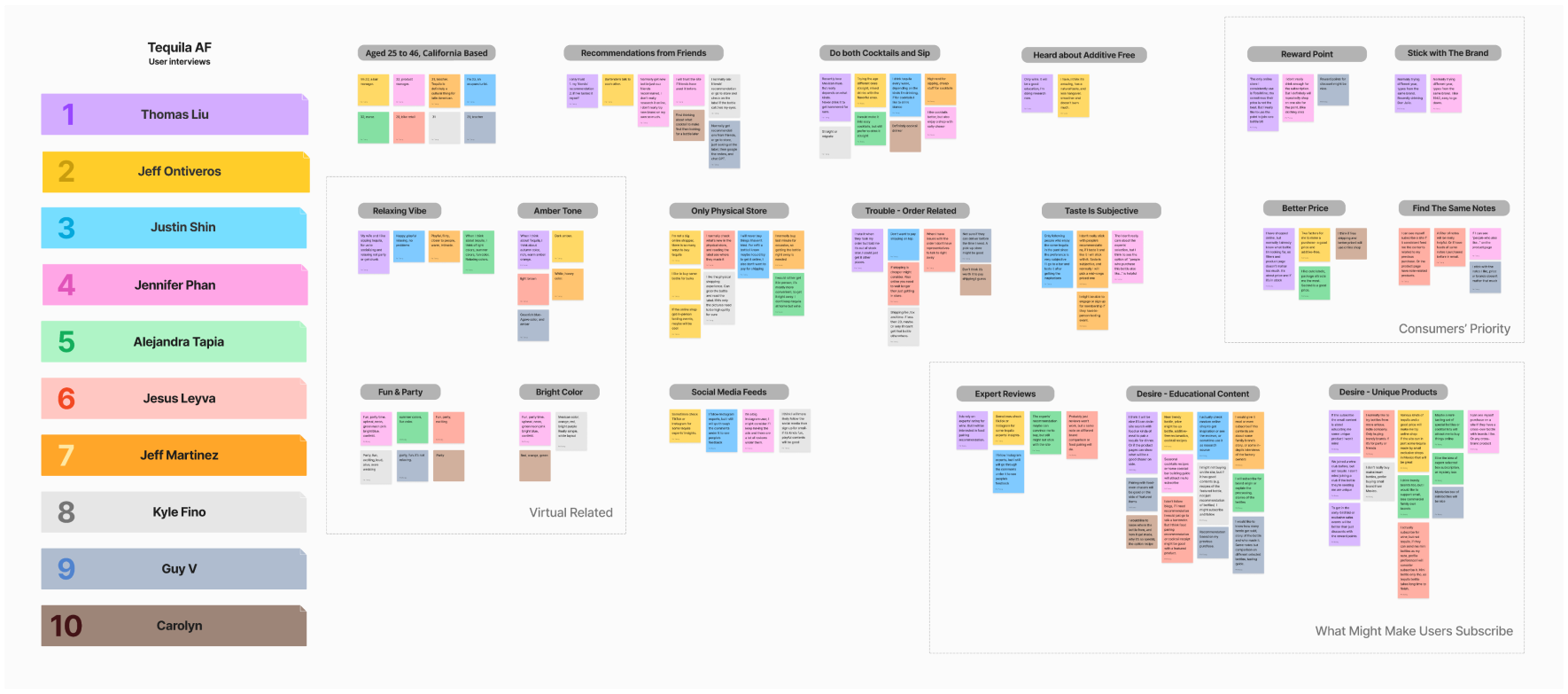
Drawing insights from 10 tequila enthusiasts, we uncover their motivations for choosing to shop for tequila online, as well as the reasons why some have hesitated to make the switch from in-store purchases, and explore what it would take to convince them to transition from in-store purchases to online shopping.


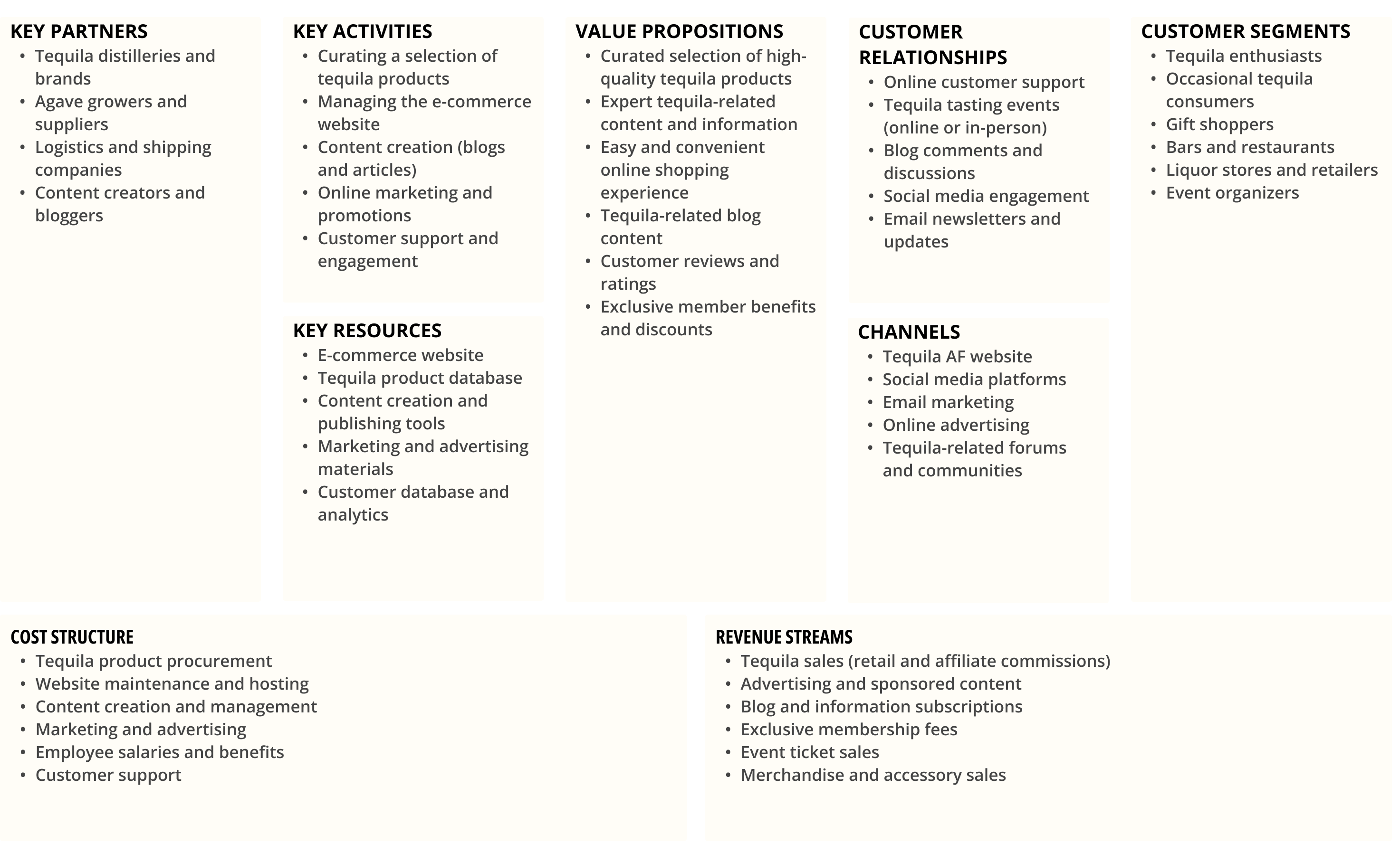
This canvas encapsulates key elements that define our strategy and approach. From customer segments to revenue streams, it provides a structured framework to understand how Tequila AF aims to create value and deliver a seamless tequila shopping experience.


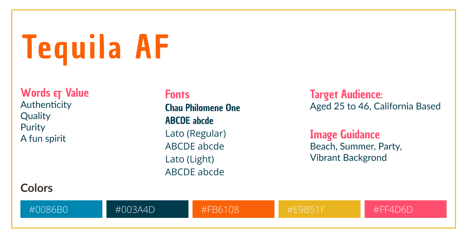

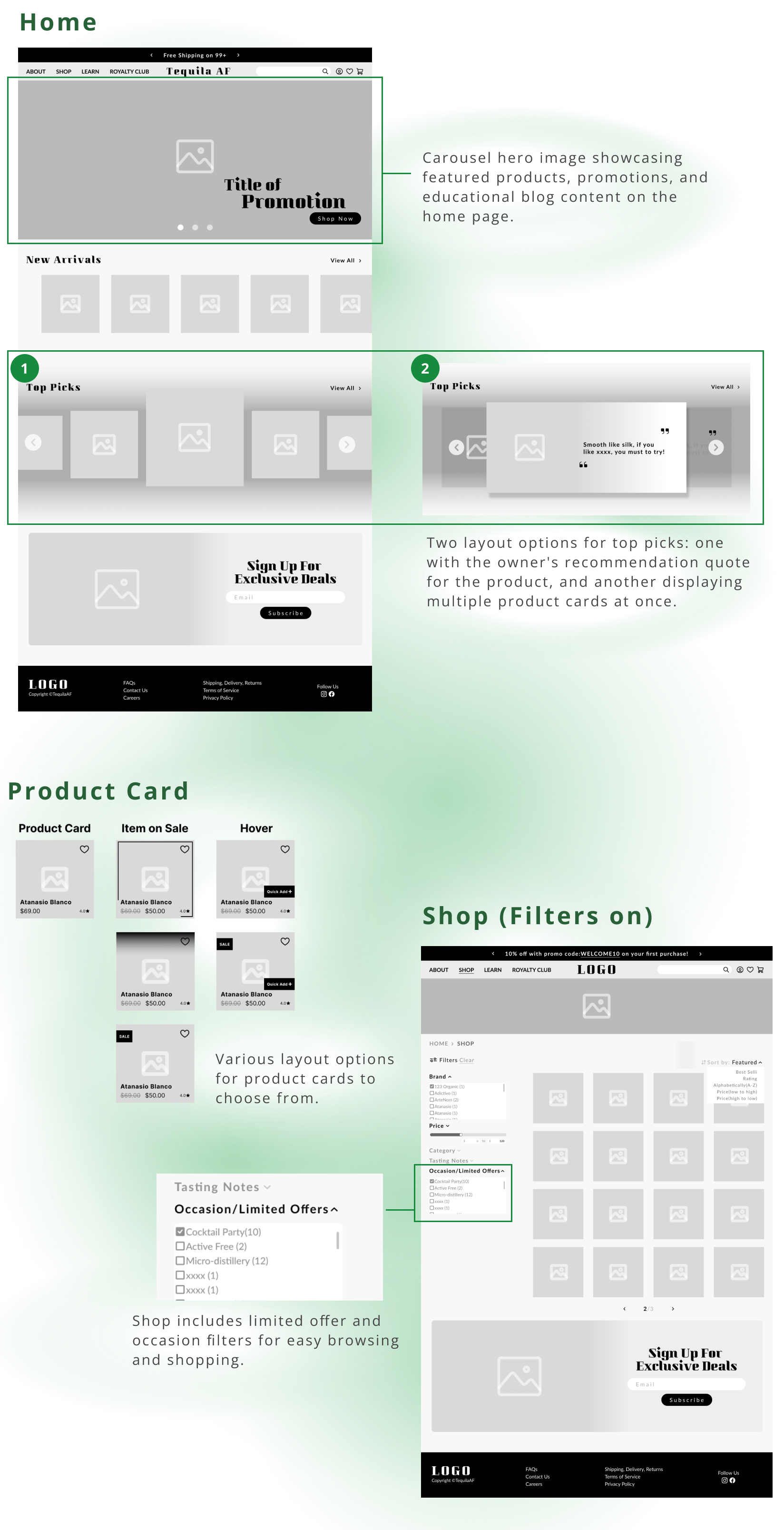
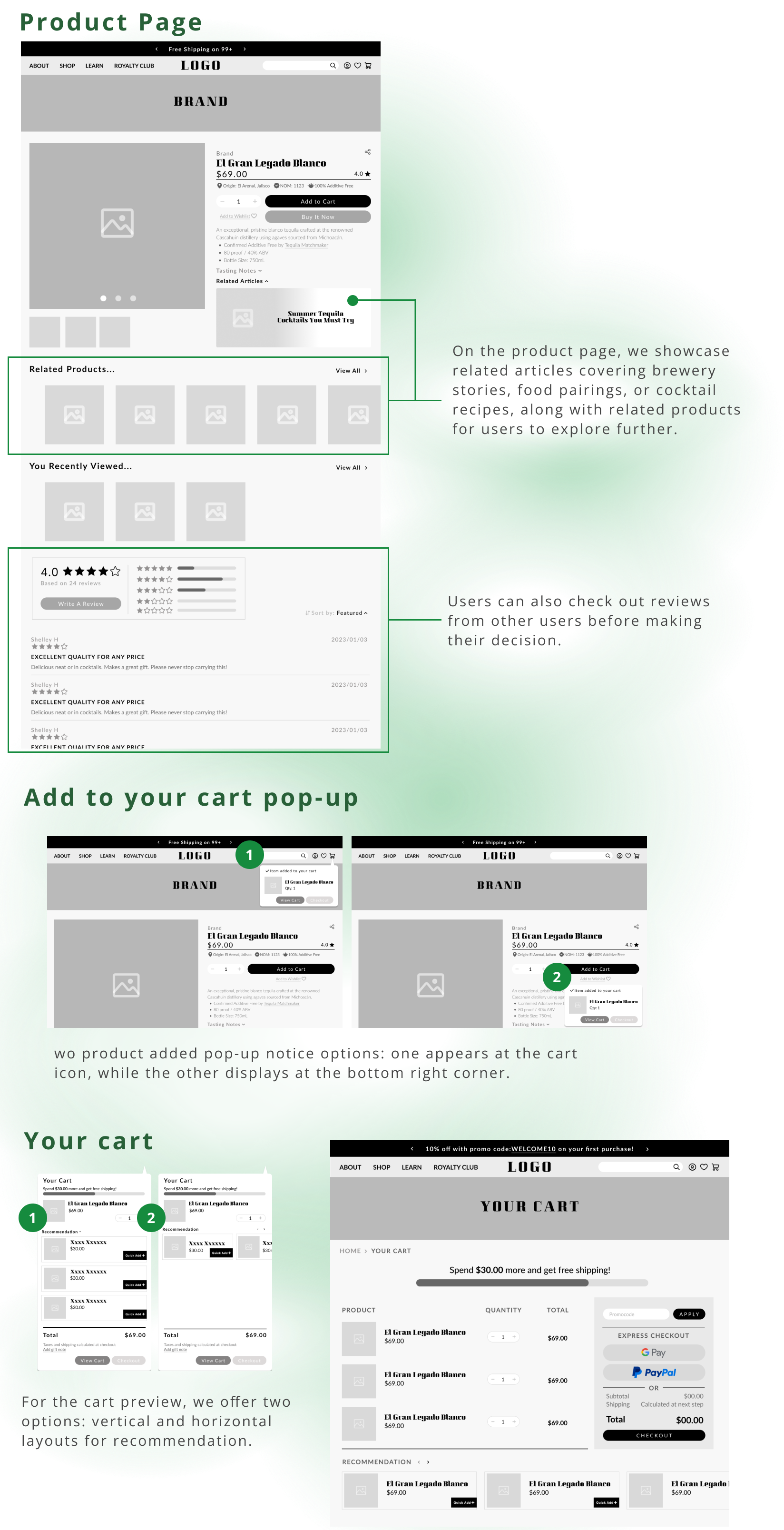
In our effort to maintain clear and effective communication with the client, we developed several iterations of layout designs for them to choose from during the Lo/Mid-Fi wireframing phase. This collaborative approach allowed us to tailor the design to their preferences and needs while ensuring a more refined and user-centric final product.


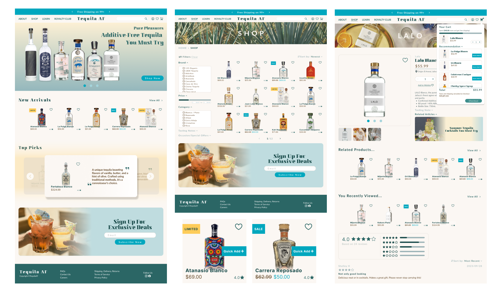
Following extensive consultations with the client and valuable insights gathered during the Lo/Mid-Fi wireframing phase, we have now progressed to the High-Fi wireframes. These advanced wireframes reflect the refined and polished design choices, bringing us one step closer to creating a visually compelling and user-friendly E-commerce platform for Tequila AF.
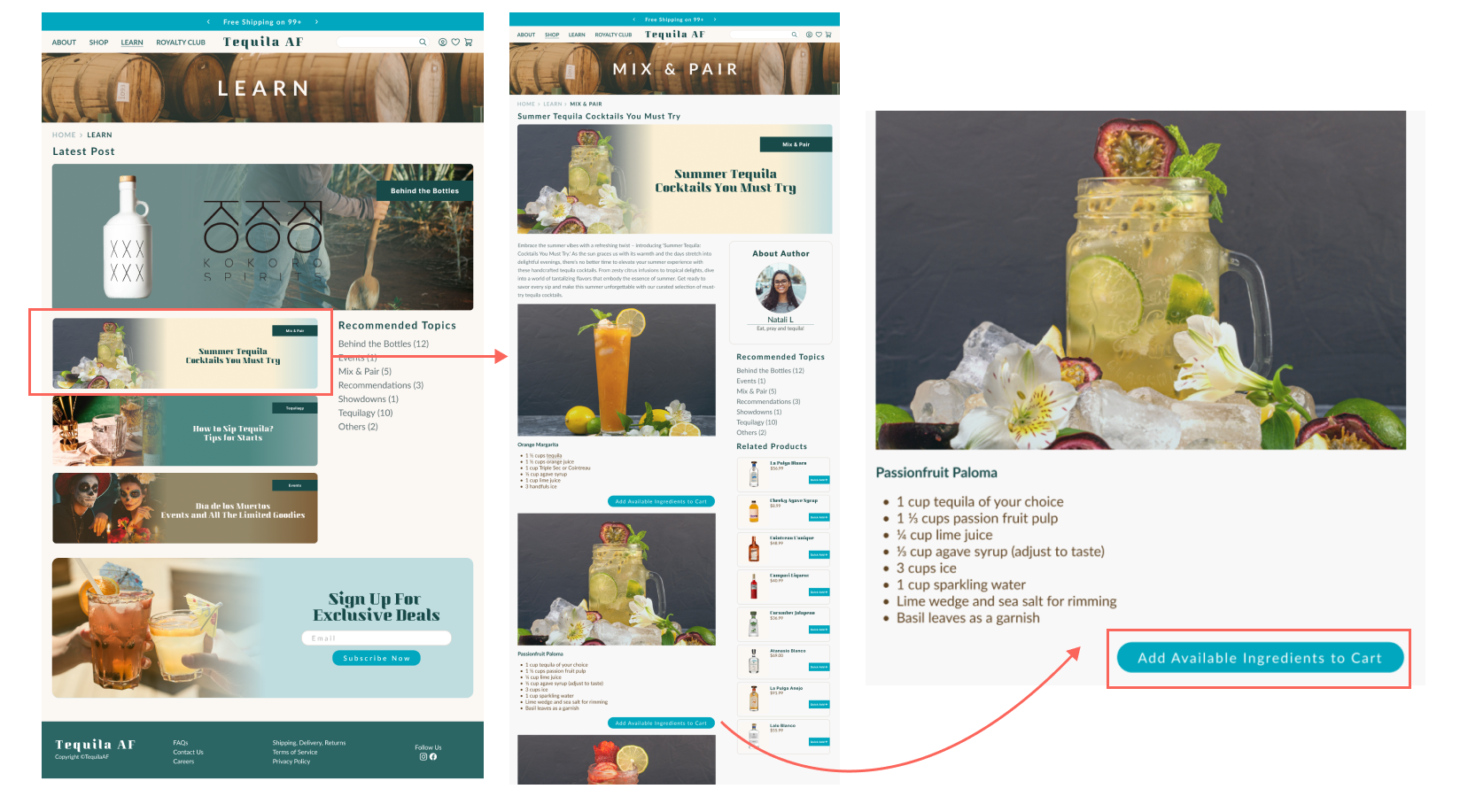
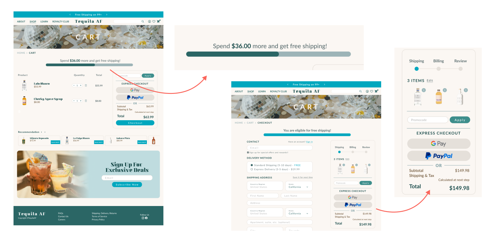


Product Under test
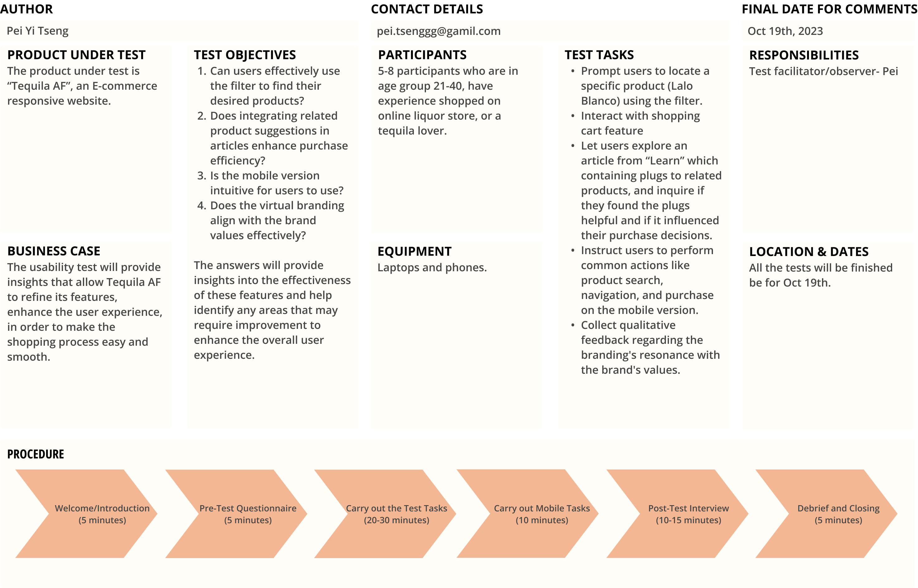
The product under test is “Tequila AF”, an E-commerce responsive website.
Business Case
The usability test will provide insights that allow Tequila AF to refine its features, enhance the user experience, in order to make the shopping process easy and smooth.
Test Objectives:
The answers will provide insights into the effectiveness of these features and help identify any areas that may require improvement to enhance the overall user experience.
Participants
5-8 participants who are in age group 21-40, have experience shopped on online liquor store, or a tequila lover.
Equipments
Laptops and phones.
Test Tasks:
Responsibility
Test facilitator/observer- Pei
Dates
All the tests will be finished be for Oct 19th.
Procedure:
We dive into the valuable insights gathered from a usability test involving 7 tequila enthusiasts.
This grid acts as a repository of feedback and observations, helping us refine and enhance the Tequila AF platform. It offers a closer look at the users' experiences, preferences, and challenges during the usability test, serving as a guiding compass for further improvements.
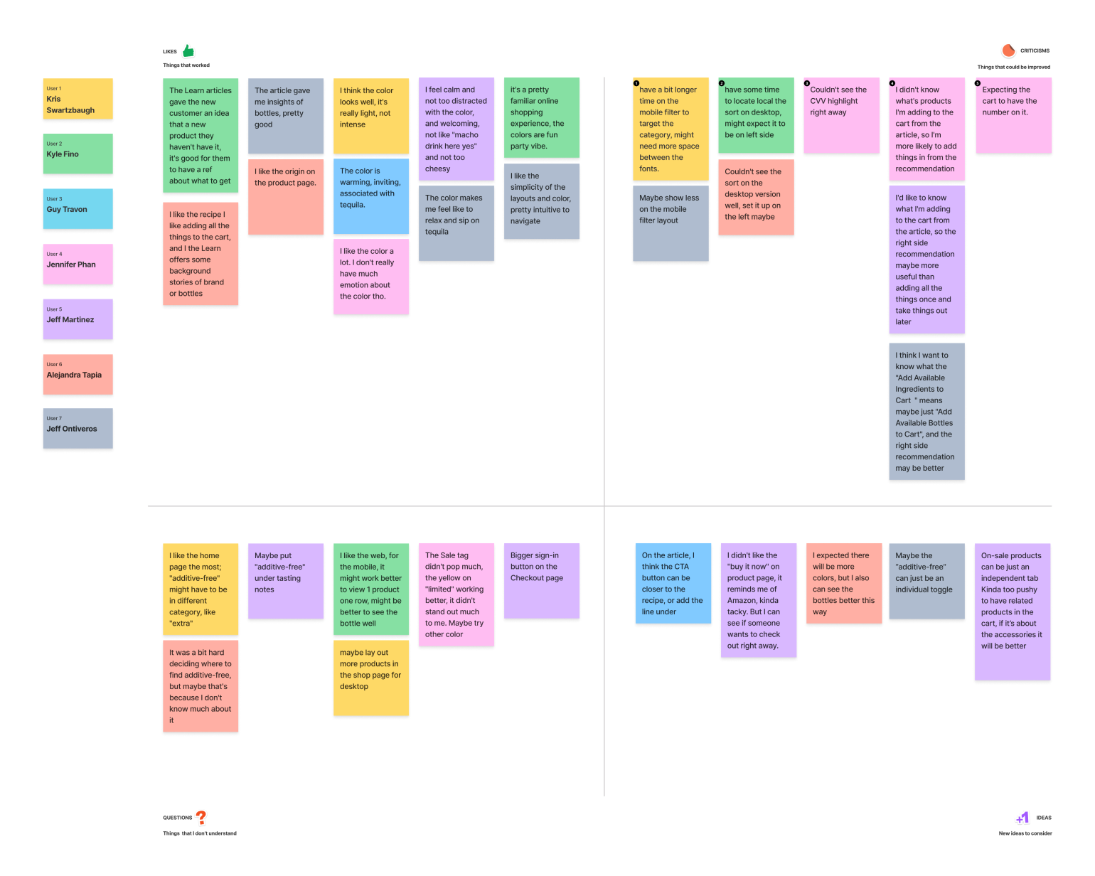

The website is well-received for its informative "Learn" articles about tequila and its welcoming color scheme, which creates a relaxed and inviting atmosphere. Users appreciate the insights provided about various tequila bottles and enjoy the simplicity of the layouts. While the mobile version's user-friendliness is appreciated, there are suggestions to improve the mobile filter's category selection. Users also note minor issues with the desktop version, such as the visibility of sorting options.
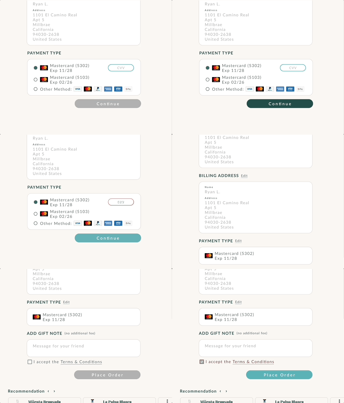
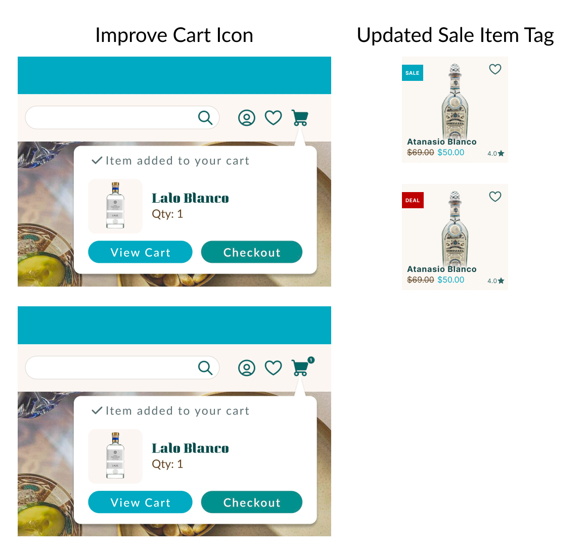
Building on valuable user feedback, we iteratively fine-tuned elements including bookmark icons, filter language, grammar, and navigation bar icons, ensuring a more polished and aesthetically pleasing user interface.
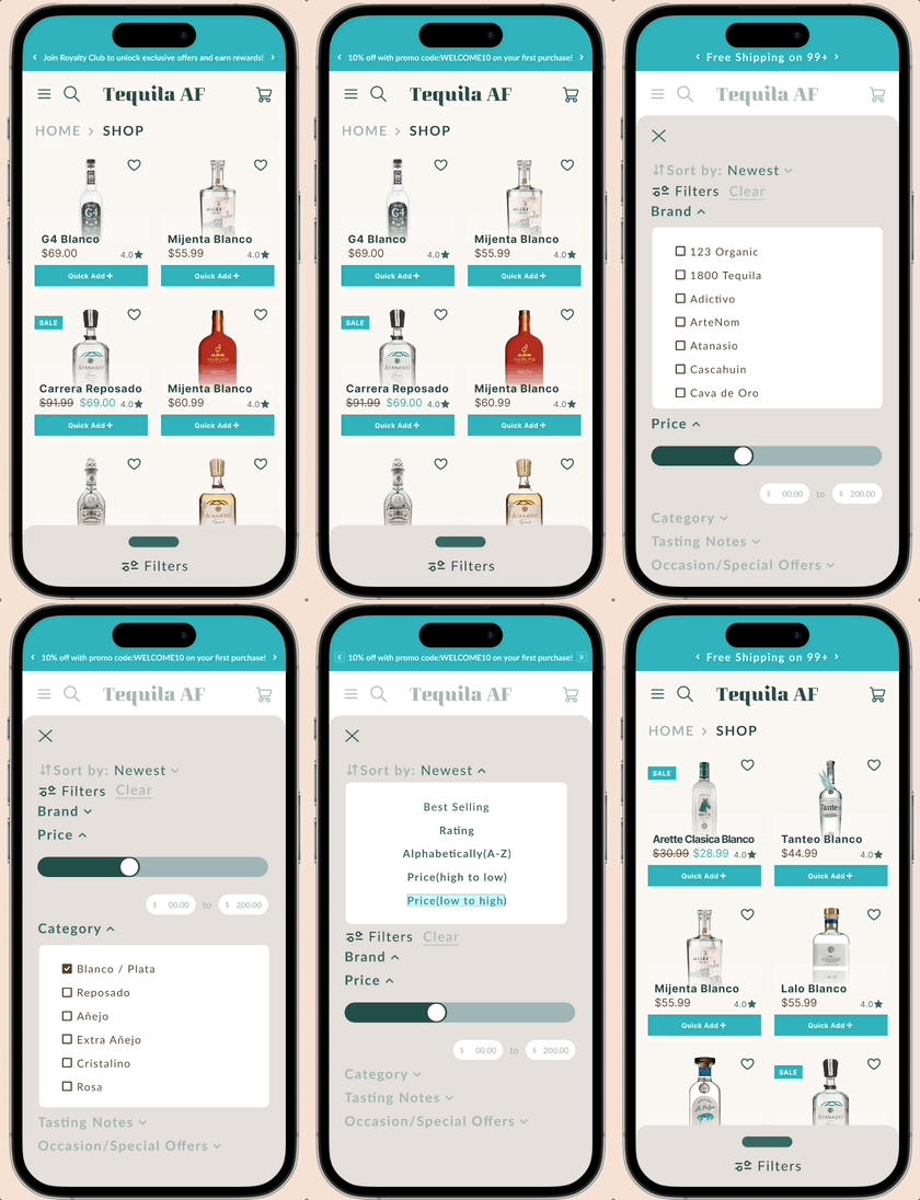
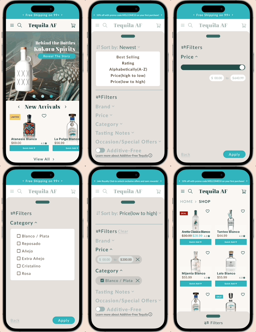
Before
After
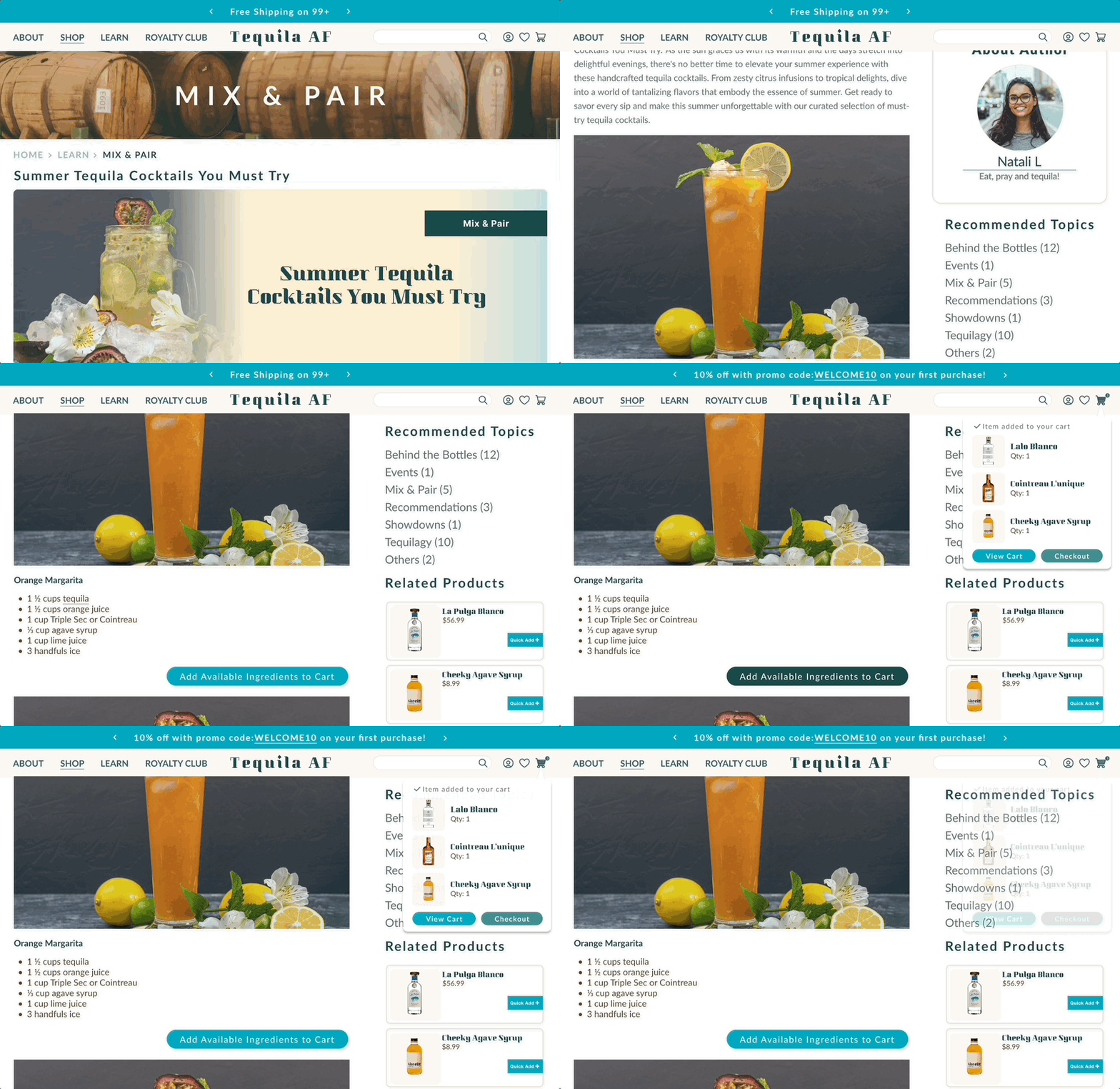
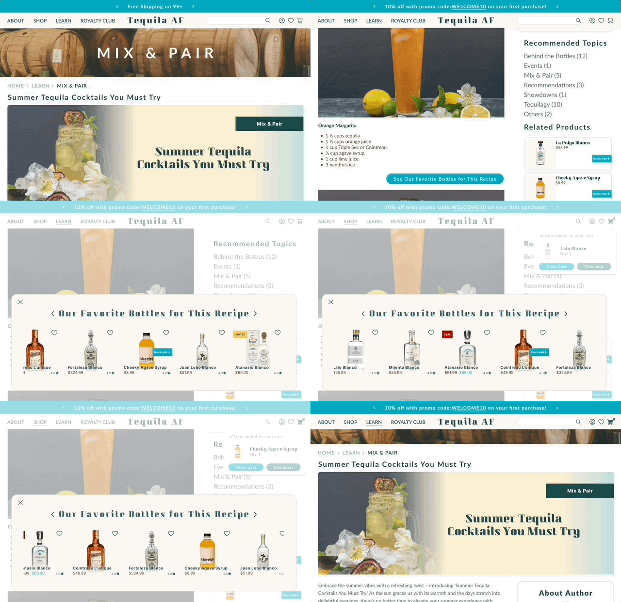
Before
After
Error Highlight
Other Changes


Before
After

Before

After

Error Highlight

Other Changes
In the development of the Final Product, we diligently integrated valuable insights gained from usability findings and constructive feedback obtained through a group session with 6 users. In an ongoing collaboration with our client, we remain committed to making informed decisions that will continually enhance Tequila AF, ensuring it maintains its trajectory of improvement.
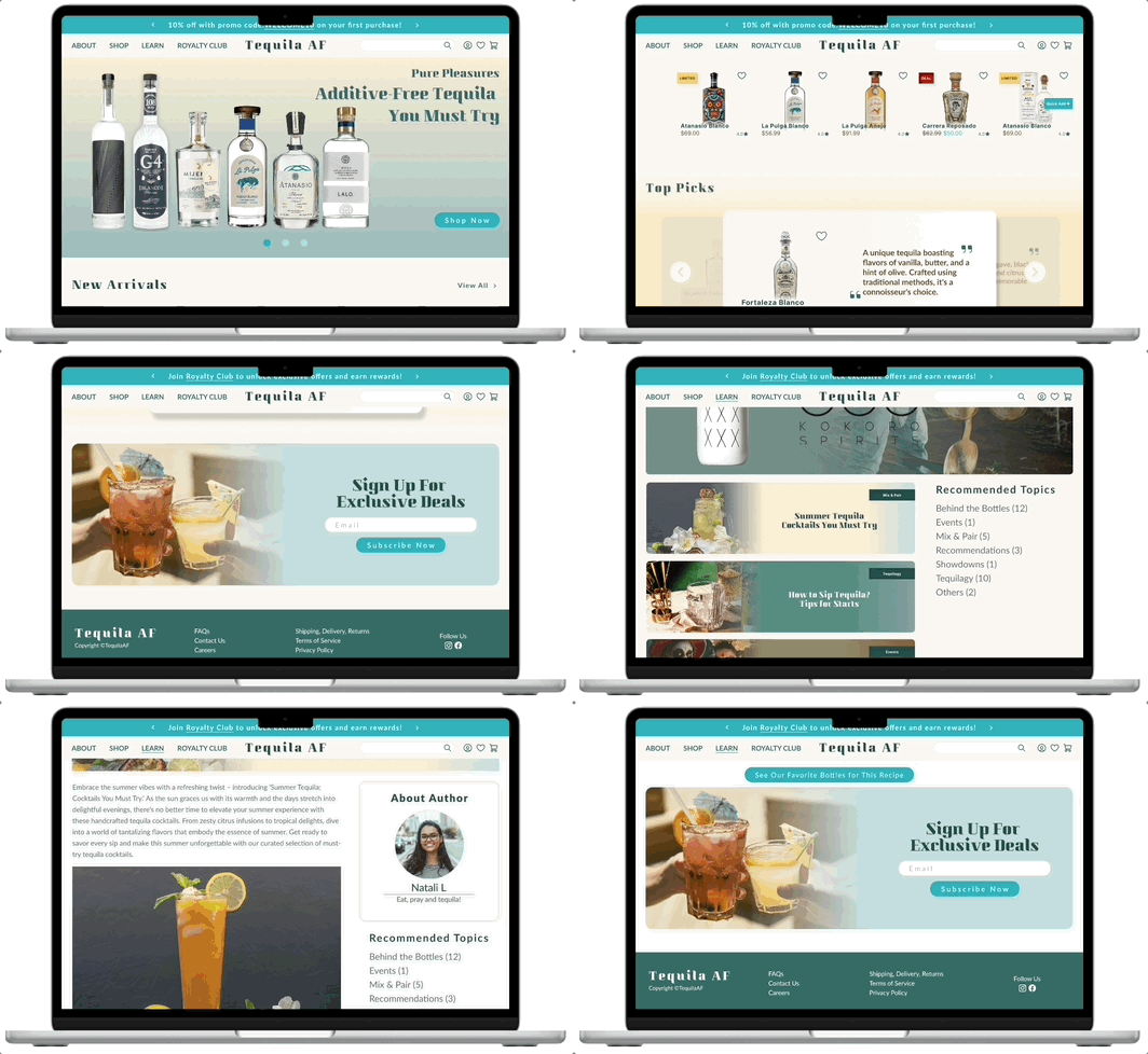
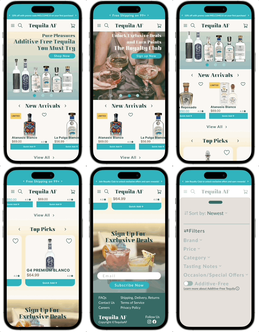
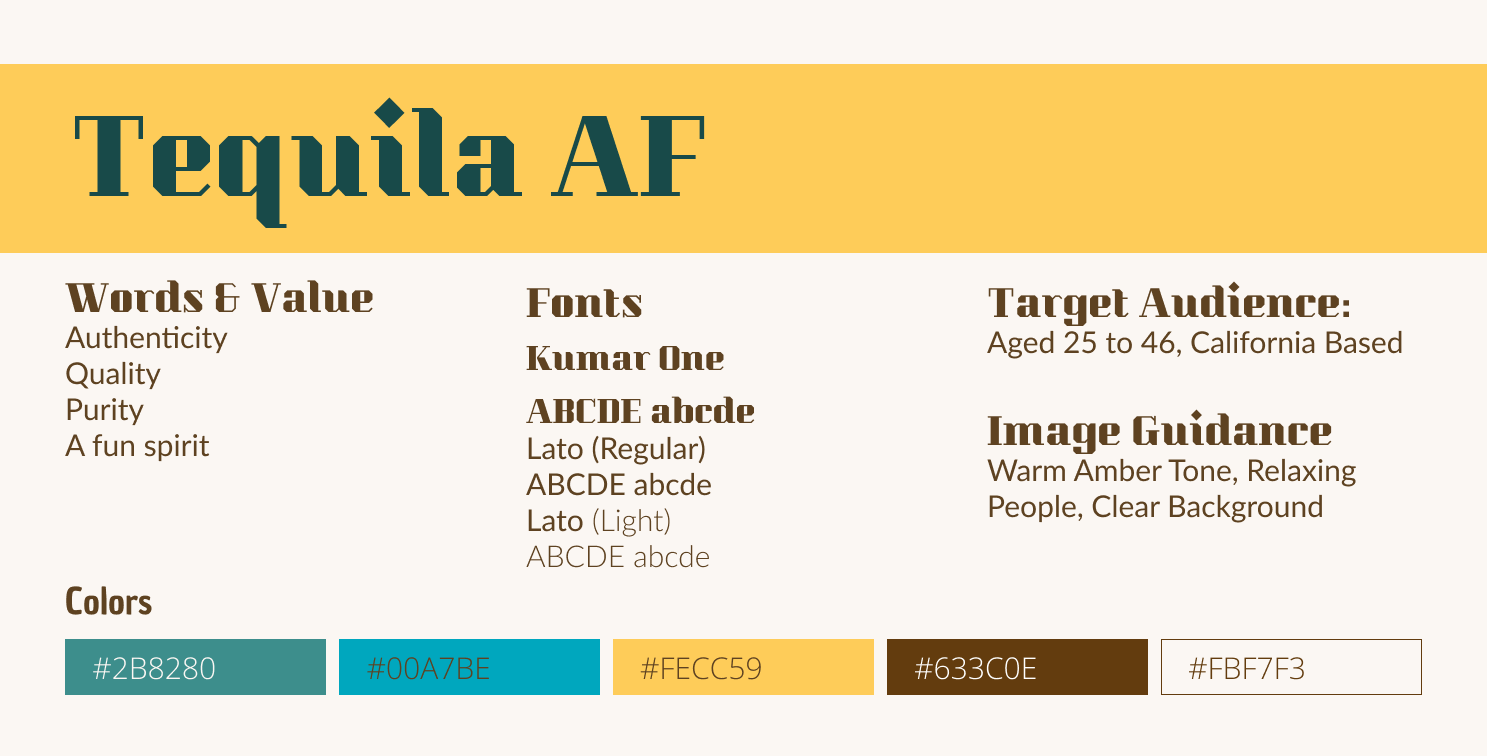
In navigating the Tequila AF project, our team skillfully blended e-commerce functionality with a profound understanding of tequila, embodying brand values such as Authenticity, Quality, Purity, and a fun spirit. From conceptualization to user testing, we not only identified user motivations and barriers but also crafted design choices that resonate with users' cravings for convenience and information. In sync with the expanding tequila market, our carefully curated color scheme, layout, and content not only establish a strong brand identity but also create an immersive and educational space that captivates and engages users.
Our commitment to refining the platform was reinforced through quantified usability test results:
This journey has offered valuable insights into consumer behavior, shedding light on their browsing habits, expectations during the checkout process, and how they navigate the site. As we approach the project's conclusion, our commitment to continuous improvement remains unwavering.

