Dev Design Daily

Role
User Research, UX/UI Design, Branding, Prototyping, Usability Testing
TYPE
Responsive News Site
TIME
2024 Feb-Apr
Overview

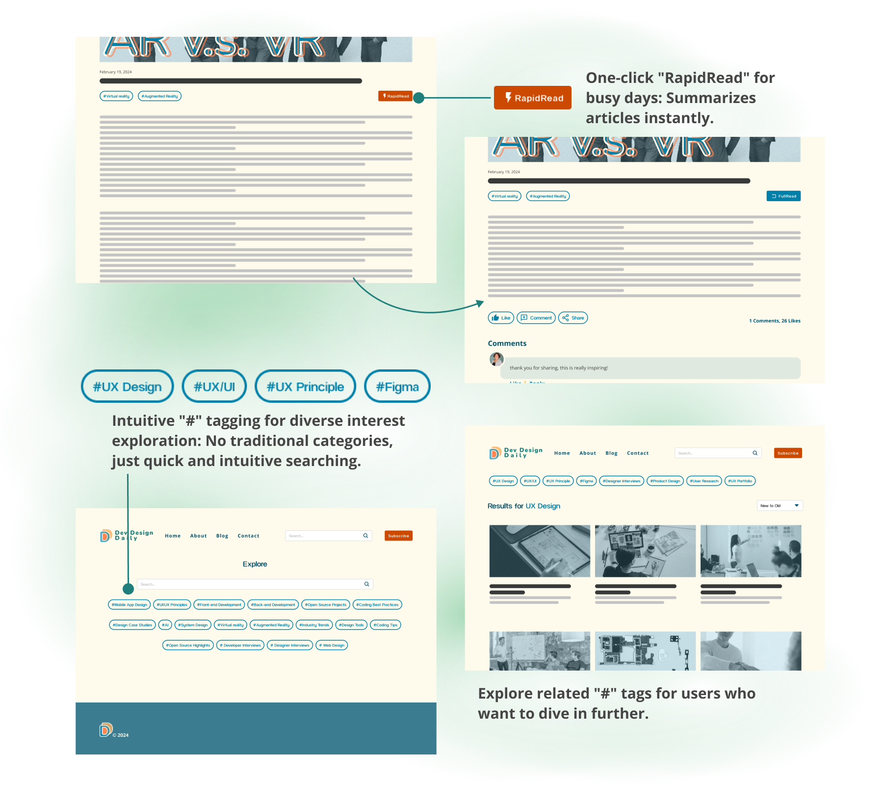
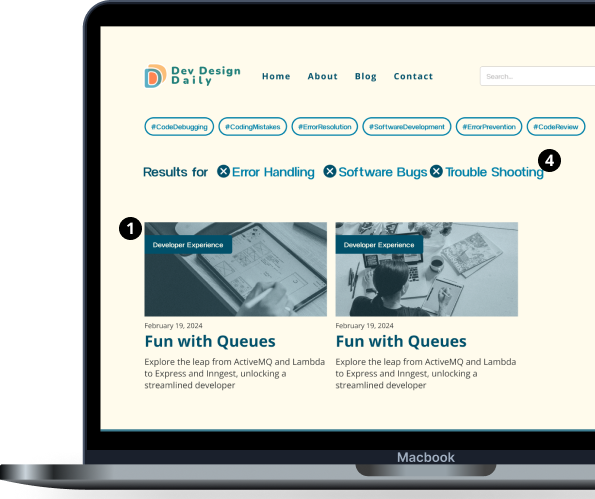
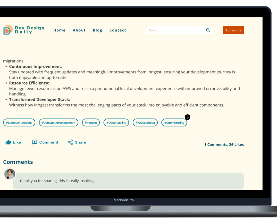
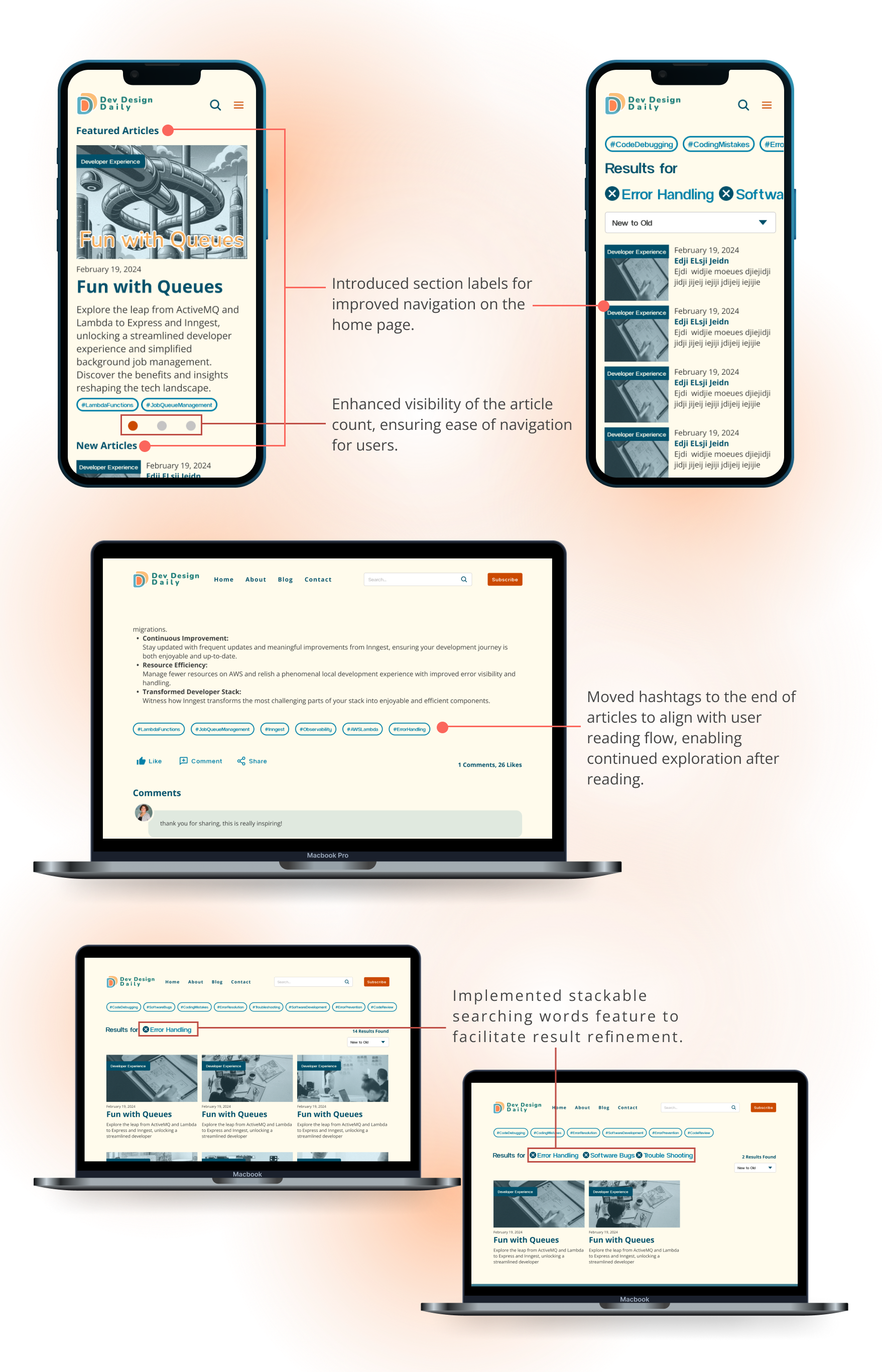
Collaborating with two developers, I ideated and implemented the "RapidRead" feature for Dev Design Daily, delivering concise, essential insights for time-constrained readers. Additionally, we replaced traditional categories with "#" tags, enabling users to easily find related articles and focus on content that matches their available time and interests. These enhancements significantly improved user engagement and satisfaction.

Challenge

In today's fast-paced world, tech and design professionals face the challenge of staying current on trends, technologies, and methodologies while managing hectic work schedules.

55 seconds icon

According to finding from Orientation, determining an ideal dwell time for an online article can vary significantly based on factors such as the article's type, publication, and reader engagement. However, the average time to read an online article is around 55 seconds.

The Nielsen Norman Group's "How People Read on the Web: The Eyetracking Evidence, a notable authority in user experience research, unveils web users rarely read pages word by word; instead, they scan for key information. Research shows that 79% of users scan new pages, with only 16% reading word by word. The study reveals a penchant for skimming content, emphasizing a preference for quick, easily digestible information over delving into lengthy articles.

79% scan
Secondary Research Finding

Besides users' reading hobbies, our research findings emphasize the significance of font selection in digital and print media, highlighting key factors that contribute to readability and accessibility.

  • Easy-to-read fonts have distinguishable height differences between upper and lower case letters, adequate spacing, and good contrast.
  • Avoid fonts with thin lines, narrow letters, or block capitalization for improved readability.
  • Popular and easy-to-read fonts include Arial, Times New Roman, Verdana, Helvetica, Georgia, and Open Sans, among others.

Source: SuperHuman, Fonts Arena, Vista Print

User Survey Findings

After meeting with stakeholders, we decided to conduct the User Survey with 10 participants comprising both designers and developers, we unveil critical insights into their roles, preferred tech news platforms, reading habits, and virtual preferences. This data serves as a strategic guide in refining Dev Design Daily to better align with the diverse needs of our vibrant user base.

  • Choice of platforms for industry insights:
    Linkedin, Medium, Reddit, TikTok, NN group, Smashing Magazine, Twitter(X), UX Planet, UX Collective, UX Lift, UX-News, Figma Blog, Mobile, OS, GIS, Tech Crunch
  • Users’ Weekly Reading Time:
    - ≤30 mins (30%)
    - 30 mins (50%)
    - 1-2 hrs (20%)

    *4 users using Desktop/Laptop; 3 users using phone; the rest of 3 using both.

  • Top 10 Users’ Interested Topics:
    - Industry Trends
    - UI/UX Principles
    - Design Tools
    - Web Design
    - Mobile App Design
    - System Design
    - Design Case Studies
    - Developer/Designer Interviews
    - Design Case Studies
    - Open Source Highlights

    *10 out of 10 enjoy short posts, but 5 users also checked in-depth articles; there are also 3 votes for podcast and 4 votes for video

  • The frequency user would like to receive updates:
    - Up to date (20%)
    - Weekly (60%)
    - 2-3 times a week (20%)

POVs
  1. I'm constantly seeking the latest trends and insights but struggle to find time for extensive reading.
  2. I need a flexible reading experience that adapts to my available time and preferred format.
HMWs
  1. How might we create a content delivery system that accommodates users' time constraints as a busy professional?
  2. How might we provide me with a customizable reading experience that allows switching between in-depth articles and summarized versions based on users' available time?
Objectives & Solutions
  • Quickly access the latest trends and insights.:
    Implement the "RapidRead" feature that provides condensed versions of articles for quick consumption.
  • Enjoy a seamless experience on any device:
    Ensure the website is fully responsive, offering a consistent and user-friendly experience across all devices and screen sizes.
  • Find relevant content for the user's professional interests:
    Suggest keywords and recommend related articles aligned with user habits, ensuring a tailored content discovery experience that caters to individual preferences and interests.
  • Align with the parent brand Mikan Labs' branding and ethos:
    Ensure Dev Design Daily mirrors Mikan Labs' visual and ethical standards, offering a coherent user experience that embodies the parent brand's minimalist aesthetics and open-source philosophy.
Branding Workshop

In this pivotal session, we delve deep into the heart of Dev Design Daily's identity, considering not just its alignment with Mikan Labs but also understanding the core brand values our stakeholders seek. From shaping the language and defining our target audience to navigating the competitive landscape and drawing inspiration, this workshop is a comprehensive exploration.

dev design daily branding development
Branding Wrokshop
Wireframes

As we transition from conceptualization to concrete design, the Mid/High-Fi Wireframes mark a crucial juncture in bringing Dev Design Daily to life. These wireframes serve as the visual blueprint, providing a detailed framework for our website's structure and functionality. In this phase, we move beyond the abstract, incorporating key design elements and interactions.

Mid/Hi-Fi Wireframe(Desktop) V.1
Mid/Hi-Fi Wireframe(Mobile) V.1 A&B
USABILITY TEST PLAN


Product Under test
Dev Design Daily is a digital hub for designers and developers, offering streamlined access to the latest in tech and design through features like "RapidRead". It serves as a one-stop platform for industry trends, insights, and community engagement.

Business Case
Dev Design Daily seeks to enhance user engagement through efficient content delivery, ensuring brand alignment with Mikan Labs and improving the overall digital experience for its users.

Test Objectives: 

5-10 participants, who's working in tech and design industry professionals.

Equipments
Laptops and phones.

Test Tasks:

Responsibility
Test facilitator/observer- Pei

Dates
All the tests will be finished be for Mar 20th.

Procedure:

Feedback Capture Grid

We dive into the valuable insights gathered from a usability test involving 10 users working in the tech field.
This grid acts as a repository of feedback and observations, helping us target what should we improve for better accessibility and usability.

Feedback Capture Grid
Findings

Users appreciate the intuitive design and straightforward navigation, finding it easy to follow and understand. The RapidRead and Hashtags feature received positive feedback, with users liking the efficient reading experience.
Moving forward, several areas for improvement have been identified. These include providing clearer labeling, such as indicating the number of featured articles and adding headers to sections for better organization. Additionally, there's a strong inclination towards mobile layout B for both the home page and menu, as it provides more space and an easier exit.

What’s next?
  • Clearer Labeling:
    Provide clearer labeling, such as indicating the number of featured articles and adding headers to sections for better organization.
  • Improve Hashtag Usage and Search Feature:
    We aim to provide clearer indications of items added via the "Add Available Bottles to Cart" button in articles, ensuring that users have a seamless shopping experience.
  • Refinement of Mobile Layouts and Navigation:
    Further, refine mobile home page and menu layouts based on user feedback and A/B testing results to optimize user experience.
Iteration From User Findings

Informed by user feedback, we iteratively refined Dev Design Daily to enhance user experience. Clearer labeling, improved navigation, and accessibility options were prioritized, ensuring a more user-centric platform.

Introduced section labels for improved navigation on the home page and enhanced visibility of the article count, ensuring ease of navigation for users.

Implemented stackable searching words feature to facilitate result refinement.

Moved hashtags to the end of articles to align with user reading flow, enabling continued exploration after reading.

dev design daily wireframe
Final Product

In the development of the Final Product, we diligently integrated valuable insights gained from usability findings and constructive feedback obtained through a group session with 6 users. In an ongoing collaboration with our client, we remain committed to making informed decisions that will continually enhance Tequila AF, ensuring it maintains its trajectory of improvement.

Insights

Throughout the Dev Design Daily project, our team adeptly fused tech news delivery with a deep understanding of user behavior and preferences. Guided by our core values of Accessibility, Innovation, and User-Centricity, we embarked on a journey from conceptualization to user testing, ensuring that every design decision resonated with our audience's desire for convenience and comprehensive information.

As the feature "RapidRead" is receiving great feedback, our dev team also considers developing it into a Google Extension, as a promotional attraction for our first sign-up readers.

Additionally, the project challenges the traditional category-based organization of news sites, providing a more straightforward search with Hashtags. This speeds up the searching process, eliminating the need for users to guess which category an article belongs to.

Looking forward, we aim to implement accessibility options for users to choose their preferred font and size for reading. Alongside this, we also plan to add more features for readers, such as in-site bookmarks to save and revisit their favorite articles.