Roomingle

Role
User Research, UX/UI Design, Branding, Prototyping, Usability Testing
TYPE
Mobile App
TIME
2023 Apr-July
(70hrs)
Overview

Roomingle is a digital platform designed to simplify the process of finding compatible roommates for shared living spaces.
The app aims to alleviate the challenges and inefficiencies that many people face when moving to a new place and seeking suitable roommates.

Background

According to MYMOVE, during the pandemic, the number of movers who filed address forwarding with USPS exceeded 15.9 million in 2019 and 2020 in the United States. 

Moving to a new place is an inevitable aspect of life, and it presents a multifaceted challenge. While some people feel more troubled about the physical act of moving, others may worry more about adapting to a new environment and living situation.

Secondary Research Findings

Who are the movers? 

Age 25-34, non-home owners in United States. - MoveBuddha
Why did they move?
For the cheaper housing prices, family-related reasons, and employment-related reasons.
- MoveBuddha
What was the challenge?  
Searching, planning, packing & moving, and learning the new area.
- YourDost

User Interviews-
What Are Users' Challenges & Desires?

Based on the secondary research, I recruited 6 participants in the age group 20-35, non-homeowners

Unexpected bad roommates-
Is there a better way to find roommates?

"I moved before the contract was due because I couldn't stand my roommate anymore. Ironically, she was referred by a close friend of mine, so it was really awkward in the end."

Unpacking struggle-
Reorganizing in an unfamiliar space is actually more troubling for the user than packing
No planning ahead-
Get the packing done by the deadline with anxiety.

"I always last-minute packed all the things, then it takes forever to unpack"

Lower the moving budget-
Wish there was a way to hire freelance movers.
Jumping around different rental platforms-
Wish to spend less energy and time on searching.

"For sourcing the new apt or moving services, I had to jumping on all different platforms"

User Interviews-
What Are Users' Challenges & Desires?

Based on the secondary research, I recruited 6 participants in the age group 20-35, non-homeowners

Interview questions

Unexpected bad roommates-
Is there a better way to find roommates?

"I moved before the contract was due because I couldn't stand my roommate anymore. Ironically, she was referred by a close friend of mine, so it was really awkward in the end."

Unpacking struggle-
Reorganizing in an unfamiliar space is actually more troubling for the user than packing
No planning ahead-
Get the packing done by the deadline with anxiety.

"I always last-minute packed all the things, then it takes forever to unpack"

Lower the moving budget-
Wish there was a way to hire freelance movers.
Jumping around different rental platforms-
Wish to spend less energy and time on searching.

"For sourcing the new apt or moving services, I had to jumping on all different platforms"

Affinity Map

Following comprehensive user interviews, an affinity map was meticulously constructed to synthesize users' desires and pain points, allowing for informed design choices deeply rooted in their needs and behaviors.

Affinity Map
Personas- Who Are Our Users?

I crafted 3 distinct personas derived from user interview insights, providing a human-centered foundation for our design decisions.

POVs

I’d like to explore ways to help people who are looking for roommates to

  1. be able to pair with people who match their expectations and living hobbits.
  2. have a better way of finding future roommates besides relying on friends’ introductions.
HMWs
  1. How might we create a roommate pairing system that allows users to find potential roommates who share similar interests and living habits?
  2. How might we develop a more effective method for people to discover and connect with potential roommates, beyond relying solely on friend introductions?
Problem Statement

The process of moving to a new place is already stressful, and finding compatible roommates for shared living spaces can add to the burden. Current methods for roommate pairing are challenging and inefficient, often resulting in mismatched living arrangements and unsatisfactory experiences.
There is a need for a more efficient and effective solution to facilitate roommate matching and ensure a positive living experience for all users.

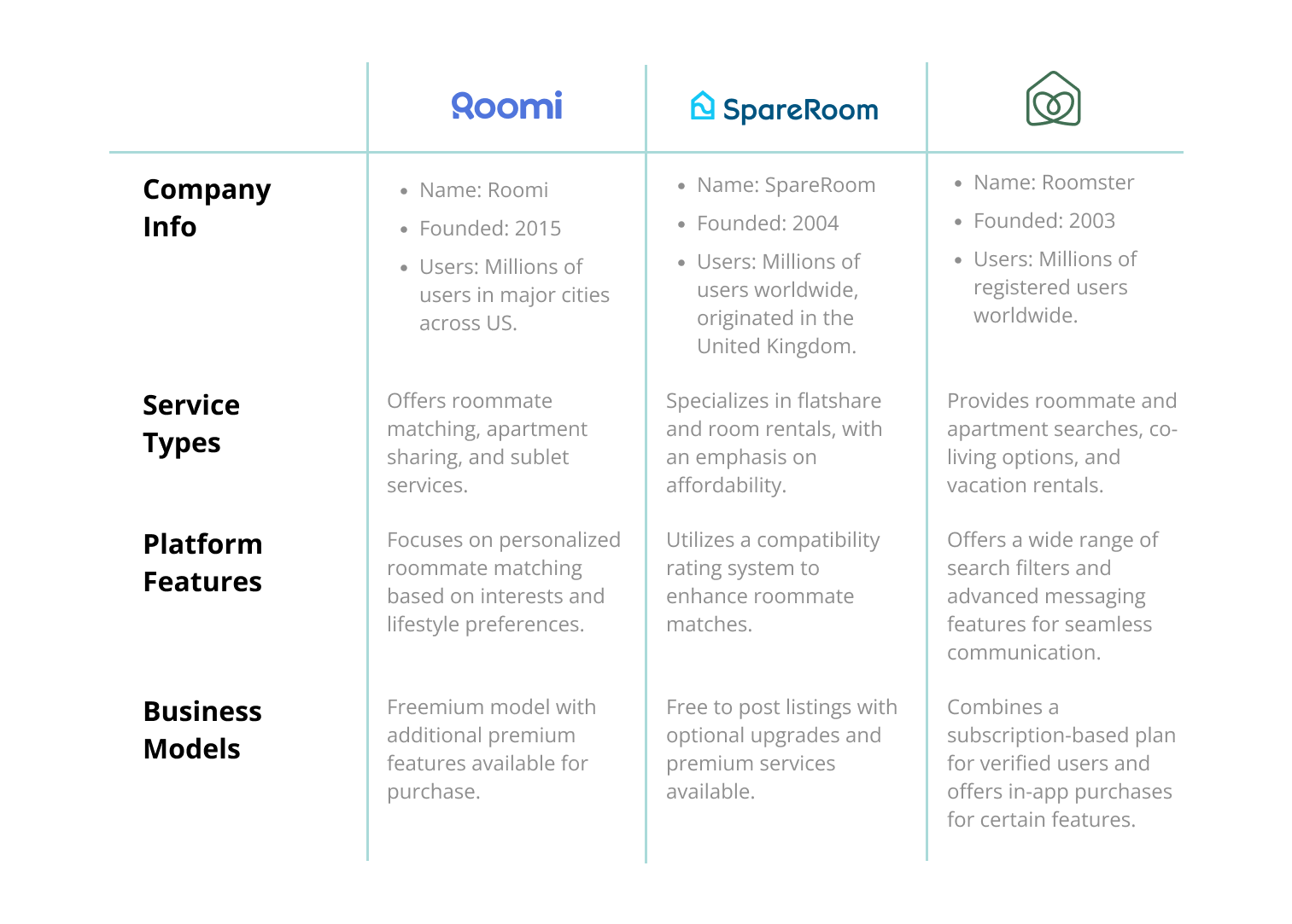
Discovering Competitive Analysis

Before jumping into brain-storming, I studied three prominent roommate pairing services: Roomi, SpareRoom, and Roomster.
Here are the key findings from our analysis:
Findings
  • Roomingle can focus on refining the roommate matching algorithm by incorporating advanced criteria beyond just interests and lifestyle preferences, such as specific living habits or preferences related to pets and smoking.
  • Implementing a robust location-based service accessible through mobile devices ensures users can easily access Roomingle on-the-go, enhancing convenience and usability.
  • By integrating with Facebook, Roomingle can enable users to see mutual friends, adding a layer of trust and familiarity in the roommate-matching process without the need for extensive inquiries.
  • Roomingle can offer value to users by displaying relevant advertisements from Zillow rental properties in the area. These ads, strategically placed and non-intrusive, can provide helpful information to users without disrupting their experience.
User Objectives & Solutions
  • Enhancing Compatibility:
    By emphasizing personality and living style preferences, the filter aims to enhance compatibility between roommates, reducing the likelihood of mismatches and promoting harmonious living arrangements.
  • Social Media Integration:
    Integrate multiple social media platforms to display mutual friends and connections between potential roommates. By leveraging social networks like Facebook, users can gain additional insights and validate the credibility of potential roommates, fostering a sense of trust.
  • Streamlined User Experience:
    Create a seamless and user-friendly experience throughout the roommate pairing process. The goal is to facilitate efficient and seamless communication between potential roommates before they meet in real life.
Storyboard

Inspired by real user experiences, I crafted a storyboard highlighting the challenges of relying solely on friends' recommendations for finding roommates, illustrating the need for a more effective approach.

Storyboard
Lo-Fi & Mid-Fi Wireframes

Translating user insights into lo-fi and mid-fi wireframes, shaping the visual blueprint of Roomingle's user interface to optimize usability and functionality.

*Please refresh the page if the slides do not fully
display due to high-resolution images.

Lo/Mid-Fi Wireframe
High-Fi Wireframes

After several group critique sessions and gathering valuable feedback, I refined the wireframes into high-fi prototypes for Roomingle's enhanced user interface.

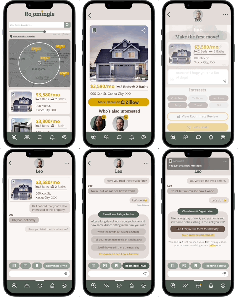
Flow 1
Users can find roommates based on interested properties' ads

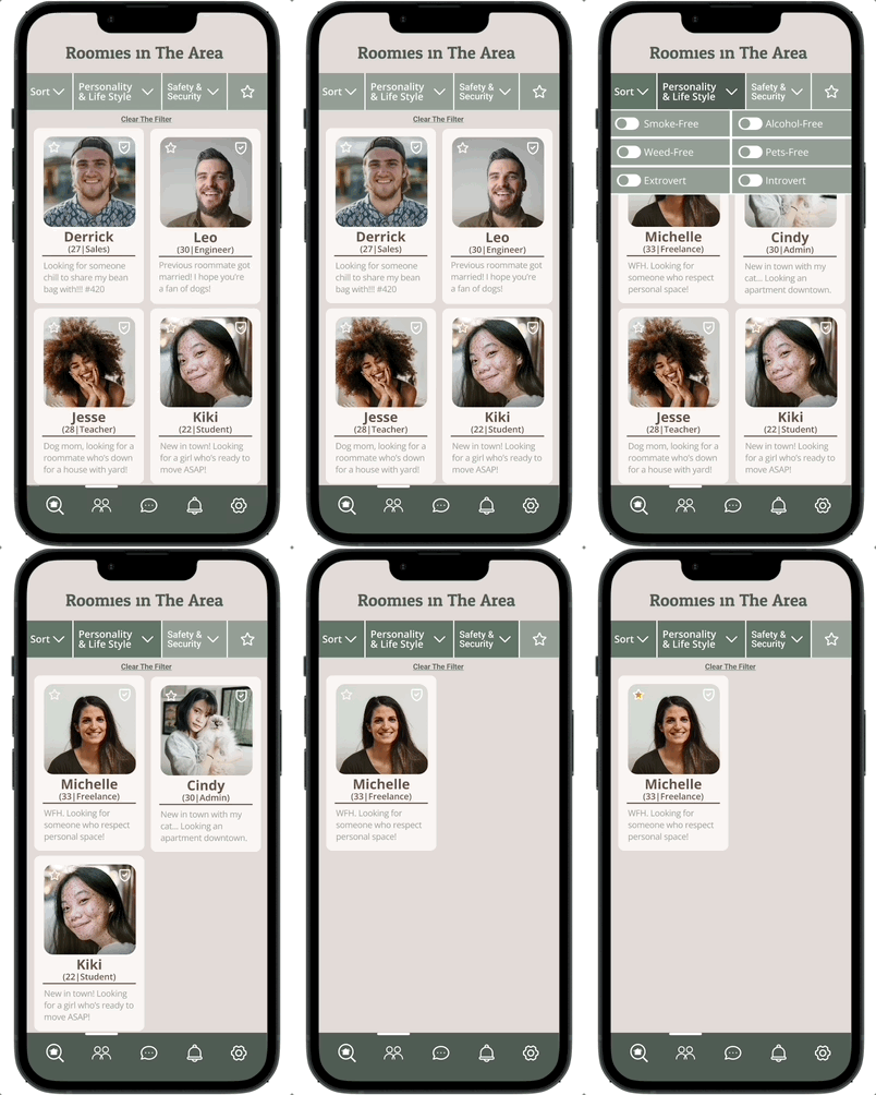
Flow 2
Users can also find roommates by using the filters to narrow down   potential roommates in the area who have similar lifestyles

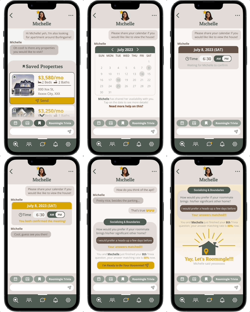
Roomingle Trivia
An in-chat feature that lightens serious questions, and calculates compatibility for a fun roommate search experience!

Shared Calendar & Liked Property
Besides the trivia, users can also share their availability with in-chat calendar, and the properties they're interested in the area.

High-Fi Wireframe V.1
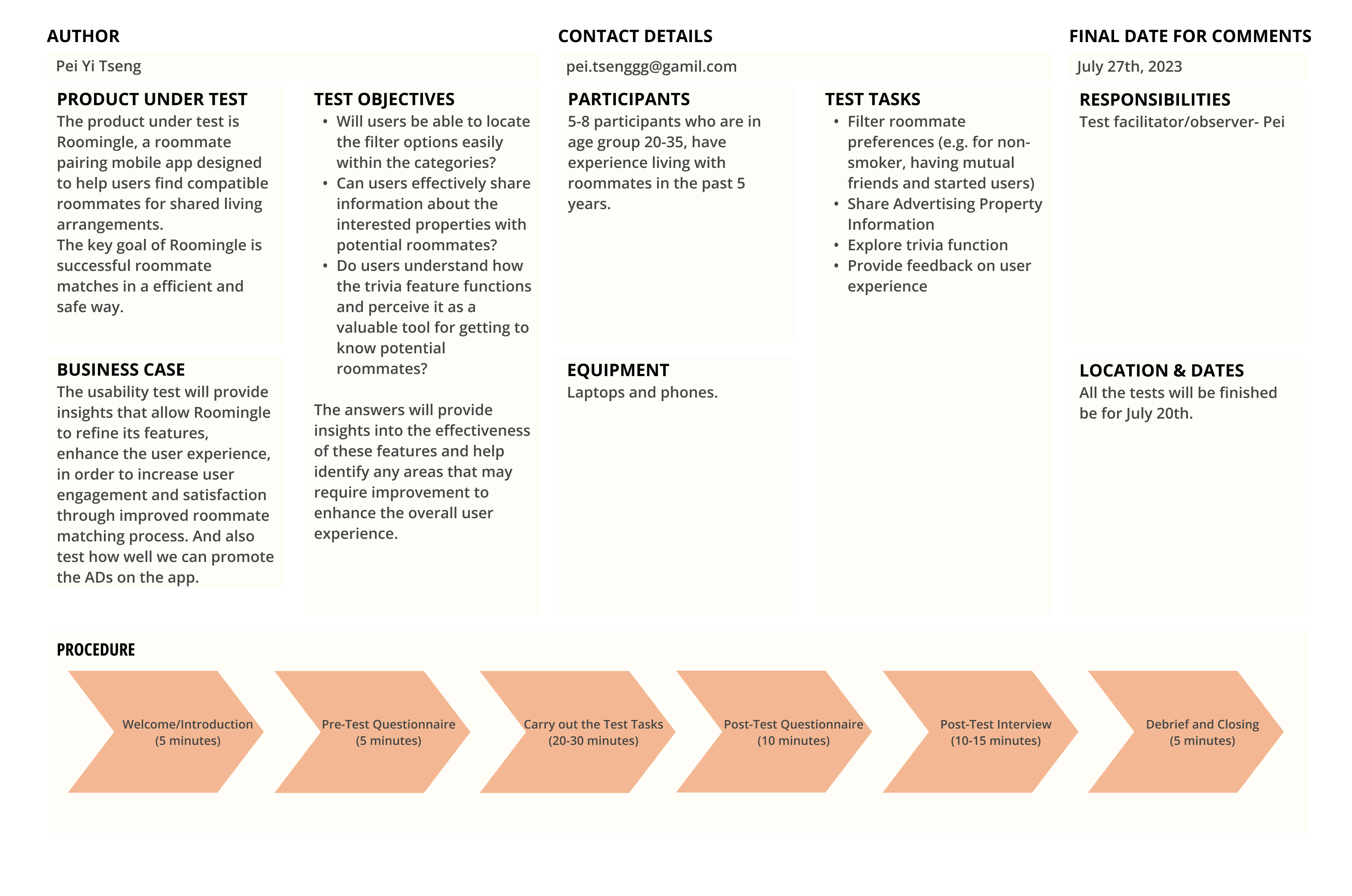
USABILITY TEST PLAN


Product Under test
The product under test is Roomingle, a roommate pairing mobile app designed to help users find compatible roommates for shared living arrangements. The key goal of Roomingle is successful roommate matches in an efficient and safe way.

Business Case
The usability test will provide  insights that allow Roomingle to refine its features, enhance the user experience, in order to increase user engagement and satisfaction through improved roommate matching process. And also test how well we can promote the ADs on the app.

Test Objectives: 

The answers will provide insights into the effectiveness of these features and help identify any areas that may require improvement to enhance the overall user experience.

Participants
5-8 participants who are in age group 20-35, have experience living with roommates in the past 5 years.
Equipments
Laptops and phones.

Test Tasks:

Responsibility
Test facilitator/observer- Pei

Dates
All the tests will be finished be for July 20th.

Procedure:

Feedback Capture Grid

Following the usability test involving 5 diverse users, we meticulously compiled their feedback and insights into a structured feedback capture grid, providing a clear overview of areas for improvement and refinement.

Feedback Capture Grid
Findings

In general, all participants successfully completed the tasks within 10 minutes, finding the design patterns similar to popular dating apps, which are familiar to our target users (age 20-35). The explanation about the prototype and task timers helped prevent excessive clicking around.
From the limited sample of 5 participants, I observed that women showed a stronger preference for chatroom tools (such as shared calendar and trivia) compared to men. During the interviews, men frequently questioned the need for chatroom features, suggesting a preference for quicker interactions and a desire to move away from the app promptly.

What’s next?
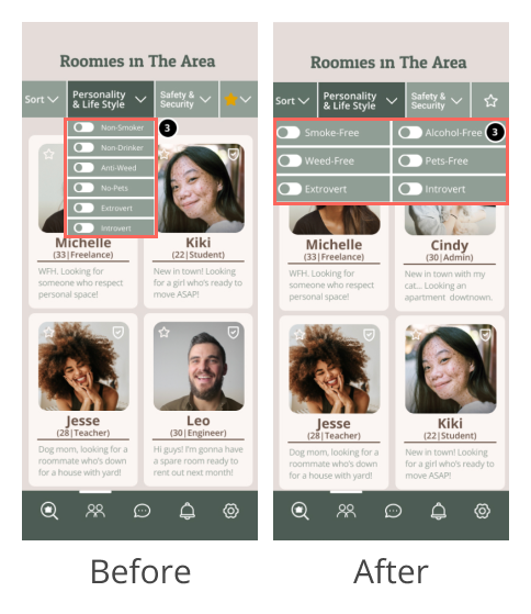
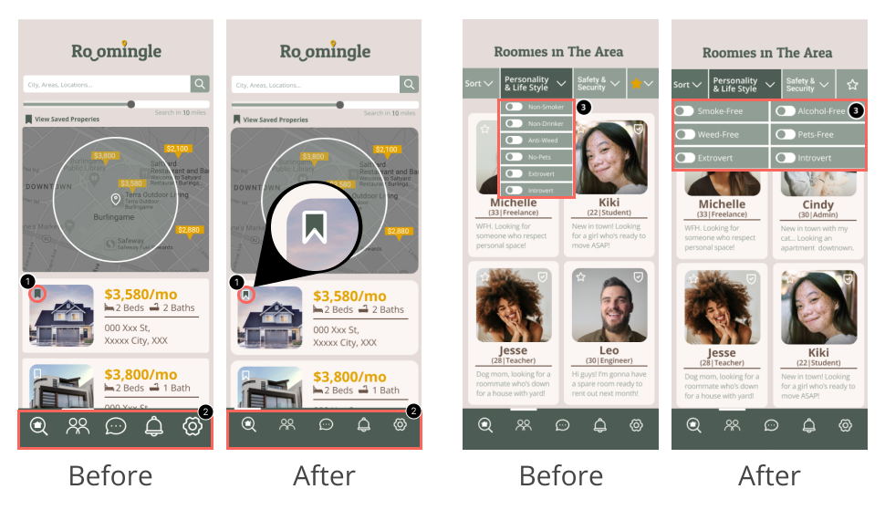
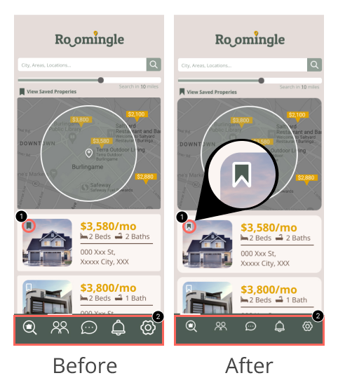
  • Refined the Bookmark Icons and Filters Layout:
    Adding a white stroke to enhance the accessibility.
  • Positive Wording for Filters:
    Replaced "anti-weed" with "weed-free" to maintain consistency with other filter criteria (e.g., "smoke-free," "pet-free").
  • Grammar Fixes:
    Addressed and corrected all identified grammar errors for a smoother user experience on the prototype.
  • Nav Bar Icon Resizing:
    Plan to experiment with resizing the navigation bar icons to achieve a less chunky appearance and enhance visual aesthetics.
Iteration From User Findings

Building on valuable user feedback, we iteratively fine-tuned elements including bookmark icons, filter language, grammar, and navigation bar icons, ensuring a more polished and aesthetically pleasing user interface.
Final Product

After an iterative and user-centered design journey, the final product encapsulates the culmination of user research, ideation, and design refinement. This represents a comprehensive solution that harmoniously addresses the identified user needs, promising an enhanced and intuitive experience in finding the ideal roommate and shared living space.
Insights

The Roomingle project has garnered positive feedback, particularly for the intuitive filters that enhance roommate preferences, ensuring a seamless experience around mutual property interests. The integration of chat room features and sorting filters has resonated well, offering a dating site-like experience. Additionally, the trivia feature has proven to be a valuable tool for users to explore compatibility with potential roommates in a fun way.

However, with more time, we'd focus on the following areas for improvement:

  • Conduct more user research and testing to gather a broader range of insights, and get to know the target market more (might be better to focus on the female market).
  • Validate and prioritize additional features through surveys.
  • Explore diverse revenue models and refine the business strategy.
  • Might try out different options of color palettes to enhance brand identity and emotional connection with users.
  • Foster a sense of community through forums or social networking.

With these enhancements, Roomingle can provide a more user-centric and efficient solution for finding compatible roommates.