Zoom Assistant

Role
User Research, UX/UI Design,  Prototyping, Usability Testing
TYPE
In-App Feature
TIME
2023 Aug-Sep
(47hrs)
Overview

In this strategic endeavor, we delve into the nuanced design and development journey of Zoom Assistant—a specialized feature intricately designed to elevate the user experience within Zoom meetings. This initiative is propelled by the overarching objective of effectively addressing challenges encountered by attendees and presenters during Zoom meetings, with a keen focus on enhancing efficiency and usability. The undertaking is rooted in the imperative for Zoom to remain competitive in the market, ensuring a steadfast commitment to industry standards and user satisfaction.

Background
& Challenge

In the era of remote work and virtual collaboration, video conferencing platforms have become indispensable tools for seamless communication.
Zoom, a prominent player in this domain, has seen a remarkable surge in users. However, this surge has illuminated various user experience challenges faced by both attendees and presenters during Zoom meetings.
In today's highly competitive market, several alternatives vie for user attention. To bolster Zoom's competitive edge, this project focuses on enhancing its functionality and user experience.

Discovering Competitive Analysis

Before jumping into brain-storming, we have Google Meet and Microsoft Team as our main competitors..
Here are the key findings from our analysis:
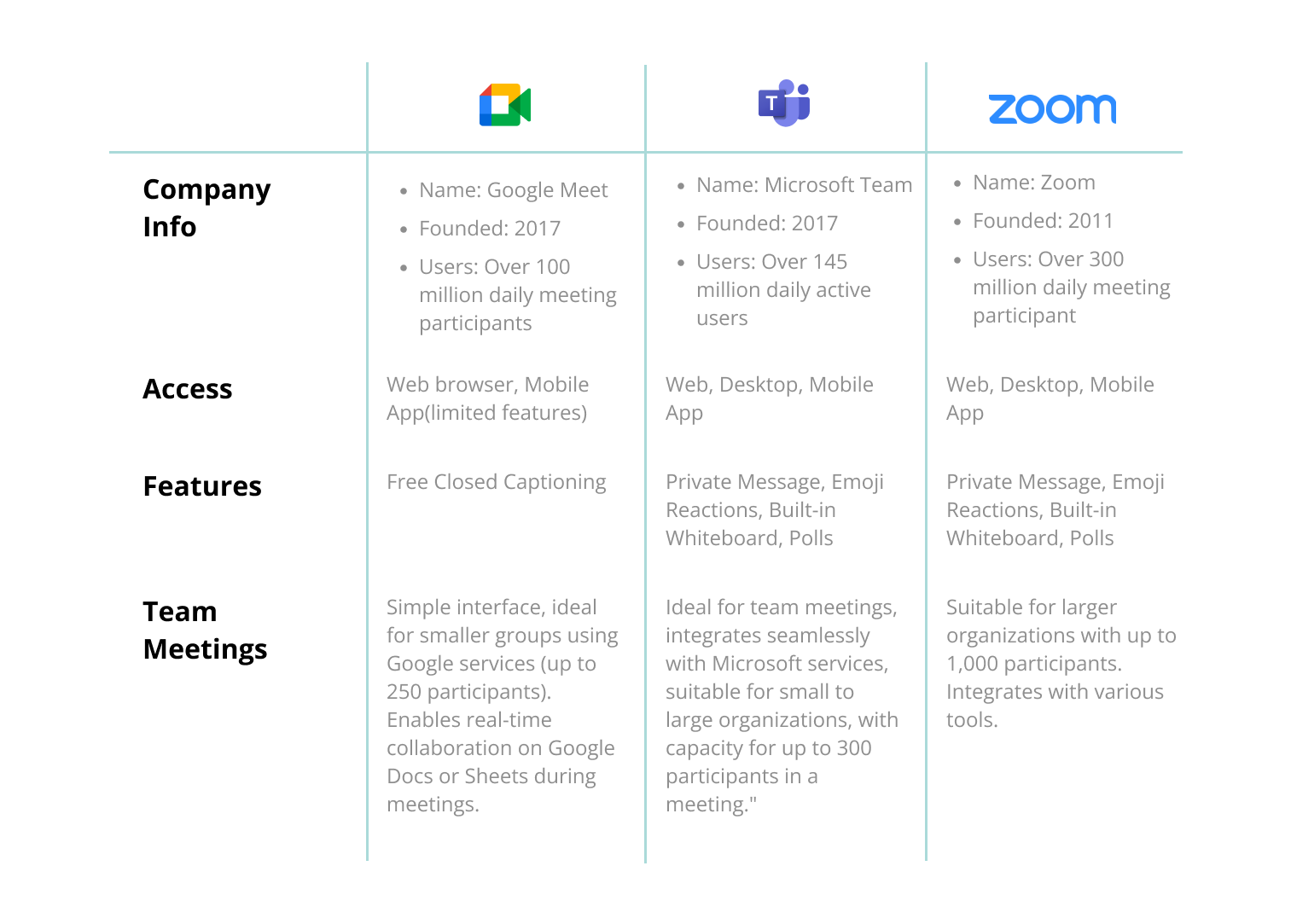

  • Company Info:
    Name: Google Meet
    Founded: 2017
    Users: Over 100 million daily meeting participants
  • Access:
    Web browser, Mobile App(limited features)
  • Features:
    Free Closed Captioning
  • Team Meetings:
    Simple interface, ideal for smaller groups using Google services (up to 250 participants). Enables real-time collaboration on Google Docs or Sheets during meetings.
  • Company Info:
    Name: Microsoft TeamFounded: 2017Users: Over 145 million daily active users
  • Access:
    Web, Desktop, Mobile App
  • Features:
    Private Message, Emoji Reactions, Built-in Whiteboard, Polls
  • Team Meetings:
    Ideal for team meetings, integrates seamlessly with Microsoft services, suitable for small to large organizations, with capacity for up to 300 participants in a meeting."
  • Company Info:
    Name: Zoom
    Founded: 2011
    Users: Over 300 million daily meeting participant
  • Access:
    Web, Desktop, Mobile App
  • Features:
    Private Message, Emoji Reactions, Built-in Whiteboard, Polls
  • Team Meetings:
    Suitable for larger organizations with up to 1,000 participants. Integrates with various tools.
User Interview - Affinity Map

With insights from 7 Zoom users, we gathered valuable perspectives on their experiences, challenges, and preferences while utilizing the platform.

Affinity Map
Findings
  • Most interviewees used Zoom for classes, work meetings, and presentations.
  • Zoom was preferred for larger events, while Google Meet was favored for quick 1:1 chats.
  • Satisfaction ratings ranged from 6 to 9 out of 10 for Zoom, if the user doesn’t have Google or Outlook Calendar to integrate with Zoom, the Satisfaction is relatively lower.
  • Desired Features and Functionalities: Improved CC functionality, improved CC functionality, enabled editing settings and scheduling within the platform.
  • The pain points are mostly scheduling and audio, and account settings related
Personas- Who Are Our Users?

I crafted 2 distinct personas derived from user interview insights, an experienced presenter and an attendee.

POVs
  1. I need a platform that offers an intuitive way to schedule meetings and manage breakout rooms, enabling seamless transitions between public and private interactions.
  2. I want to deliver engaging presentations by easily sharing my screen and maintaining clear audio.
  3. I require features like automatic language detection for C.C.I seek a consistent and user-friendly interface, and learn it in a short time.
HMWs
  1. How might we make Zoom's scheduling smooth without interrogating with other platforms?
  2. How might we design an easily accessible settings menu that allows users to personalize their meeting experience, ensuring their preferences are saved for future meetings? 
  3. How might we let users learn all the features in a short time?
User Objectives & Goals
  • Optimize Settings Process:
    Develop a guided pathway to help users quickly navigate to settings, enhancing the overall efficiency of locating and modifying settings within the Zoom interface.
  • In-App Troubleshooting:
    Implement an in-app troubleshooting feature to allow users to diagnose issues without the need to switch to a web browser, providing a seamless experience in resolving problems or finding Q&A.
  • Facilitate Learning Advanced Features for Presenters:
    Create an intuitive learning experience within the app that helps presenters easily grasp and utilize more advanced features, empowering them to enhance their presentations and interactions during meetings.
Lo-Fi & Mid-Fi Wireframes

Exploring early-stage Lo-Fi wireframes and advancing to Mid-Fi wireframes, providing visual insight into the design evolution of the Zoom Assistant.

*Please refresh the page if the slides do not fully
display due to high-resolution images.

High-Fi Wireframes & Prototype V.1

Following iterative design and meticulous consideration of Zoom's design patterns, we transitioned our concepts into High-Fidelity Wireframes. These wireframes embody the refined and polished vision of the Zoom Assistant, showcasing the optimal user interface and interaction elements for a seamless meeting experience.

Flow 1
A tutorial to set up breakout rooms
and tips.

Flow 2
A guidance for recording the meeting

Flow 3
Troubleshooting for video/camera issues.

*Please refresh the page if the slides do not fully
display due to high-resolution images.

USABILITY TEST PLAN


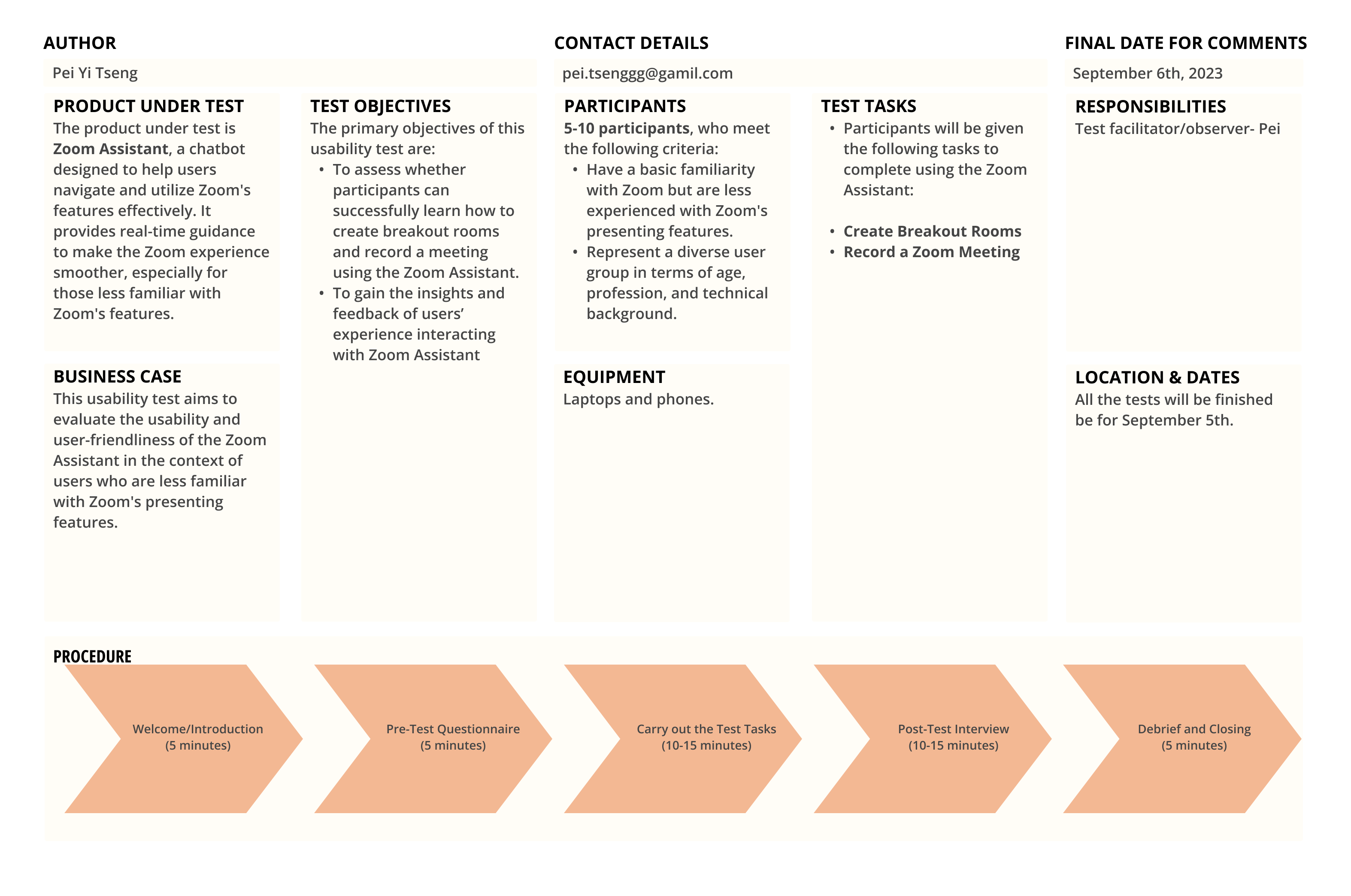
Product Under test
The product under test is Zoom Assistant, a chatbot designed to help users navigate and utilize Zoom's features effectively. It provides real-time guidance to make the Zoom experience smoother, especially for those less familiar with Zoom's features.

Business Case
This usability test aims to evaluate the usability and user-friendliness of the Zoom Assistant in the context of users who are less familiar with Zoom's presenting features.

Test Objectives: 


Participants
5-10 participants, who meet the following criteria:Have a basic familiarity with Zoom but are less experienced with Zoom's presenting features.Represent a diverse user group in terms of age, profession, and technical background.

Equipments
Laptops and phones.

Test Tasks:

Responsibility
Test facilitator/observer- Pei

Dates
All the tests will be finished be by Sep 7th

Procedure:

Feedback Capture Grid

Following the usability test involving 5 diverse users, we meticulously compiled their feedback and insights into a structured feedback capture grid, providing a clear overview of areas for improvement and refinement.

Feedback Capture Grid
Findings

The Zoom Assistant received pretty positive feedback from users, with most participants finding it helpful and efficient. On a scale of 1-10, the feature's usefulness was rated between 7 and 10. Users appreciated the guidance and tips provided by the assistant. While there was a consensus that the feature was beneficial, some users had specific suggestions for improvement

What’s next?
  • Visibility of Room Numbers:
    Several users found it challenging to see the number of rooms. It's worth noting that this issue is related to the Zoom platform itself rather than the Zoom Assistant.
  • Video Distraction:
    The alto-play video preview might be too distracting for users during the meeting.
  • Adding Arrow Animation:
    besides the highlight, maybe adding an arrow for the first few seconds
Iteration From User Findings

In response to valuable user feedback and with the objective of refining the Zoom Assistant further, we plan to conduct an A/B test focused on optimizing the video feature. Our aim is to enhance user task completion efficiency, and here are the 2 options-

Option 1
The video will play when users click on it. (No alto-play)

Option 2
Only text options will be displayed on the prompt, allowing users to choose whether to play the video.

*Please refresh the page if the slides do not fully
display due to high-resolution images.

Final Product

After conducting an A/B test involving a group of 6 users and collecting valuable feedback from previous interviewees, Option 2 emerged as the clear winner. This option, refined based on insights and preferences of our users, has been seamlessly integrated into our final product.

Insights

Throughout this project, designing and developing the Zoom Assistant proved to be a rewarding challenge. The primary objective was to simplify the Zoom learning/troubleshooting experience, ensuring smooth navigation for both novices and regular users.
In our usability tests, the Zoom Assistant received positive feedback from users, with a usability rating ranging from 7 to 10 on a scale of 1-10. Users appreciated the guidance and tips provided, marking it as helpful and efficient.
A deeper dive into A/B testing could have provided valuable insights into how users interact with video prompts or other features. Options such as in-app expanded video windows or the prompt for playing the video only when desired were considered, with the latter being chosen based on user preferences.
Given more time, delving into accessibility features would have been imperative. Making the Zoom Assistant compliant with accessibility standards would ensure inclusivity and a broader user reach.
In summary, this project highlighted the importance of user-centric design, continuous testing, and adaptability. It has provided valuable learnings for future endeavors, emphasizing the need for a holistic approach that considers diverse user needs.